Typography Project A03
September- October '15
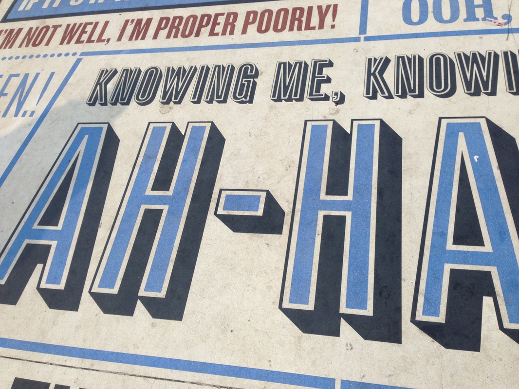
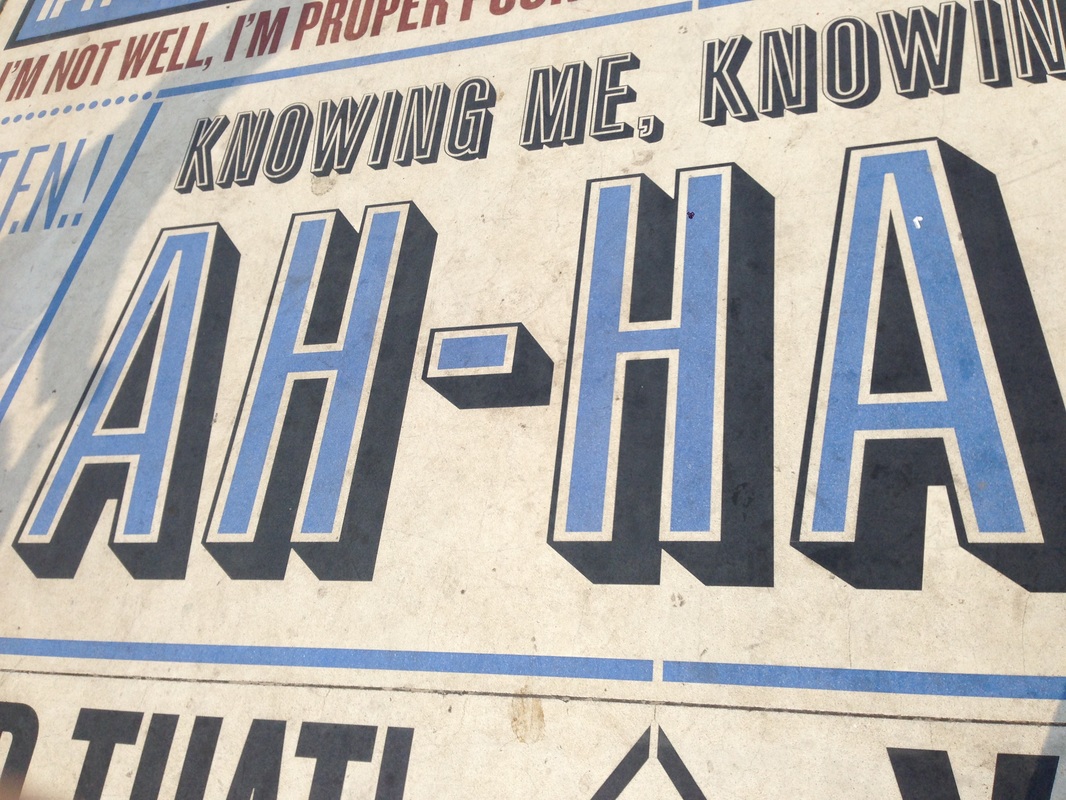
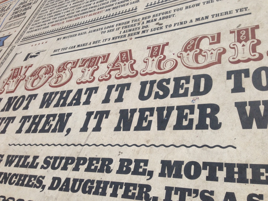
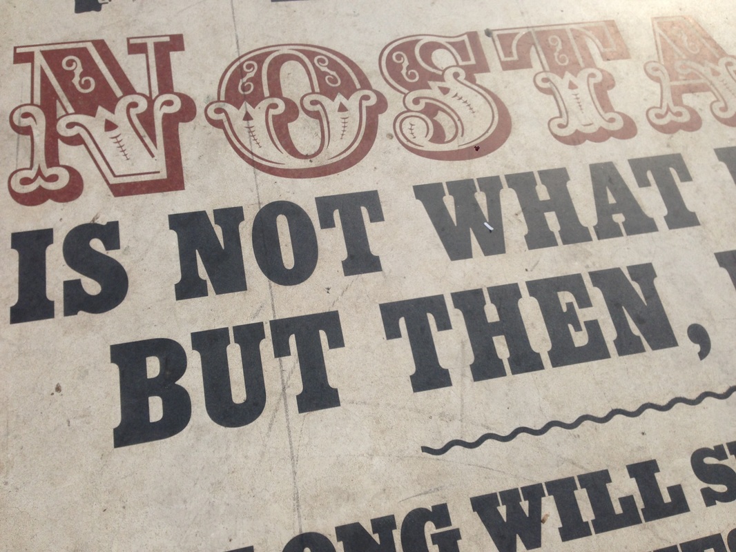
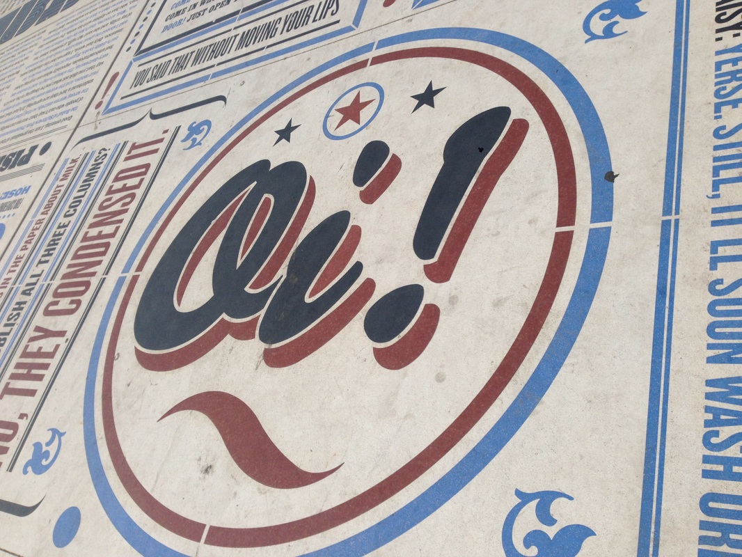
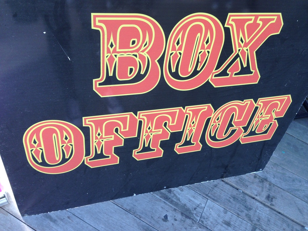
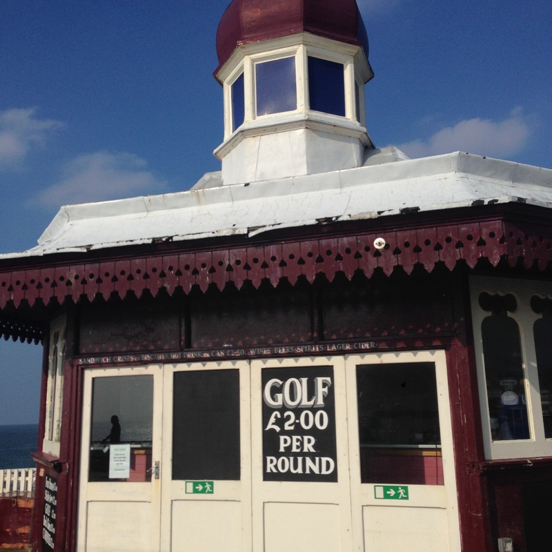
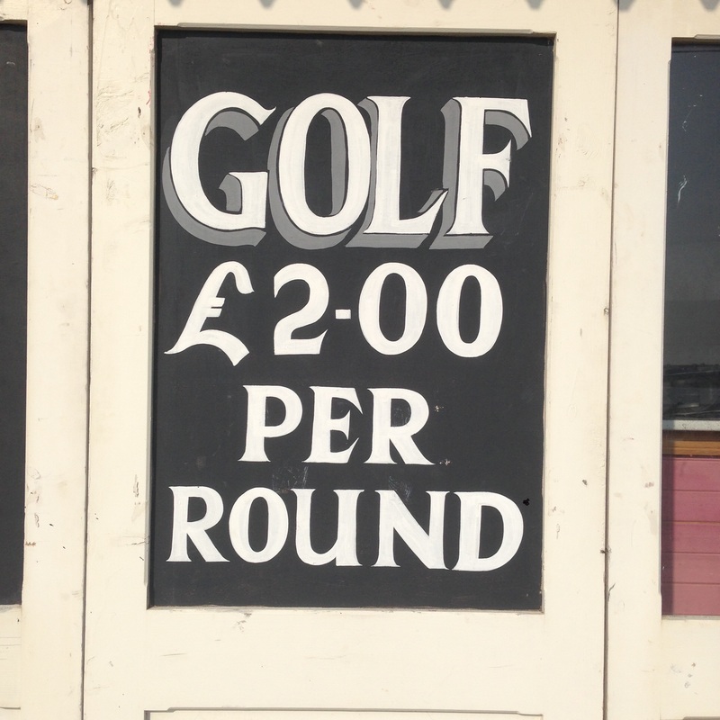
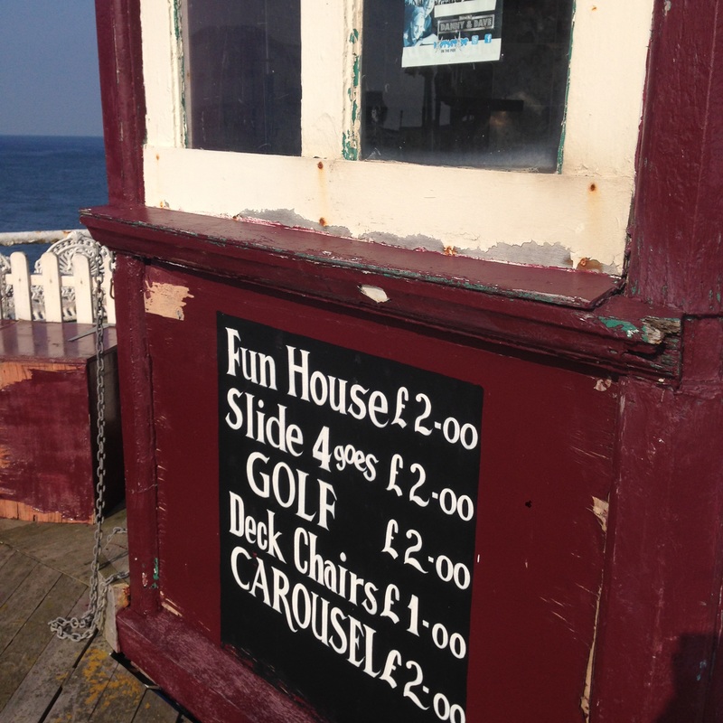
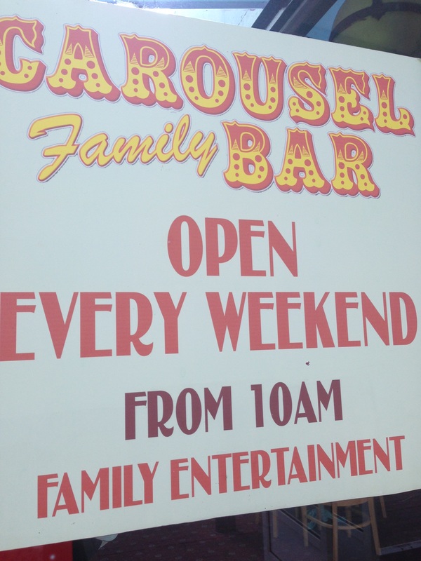
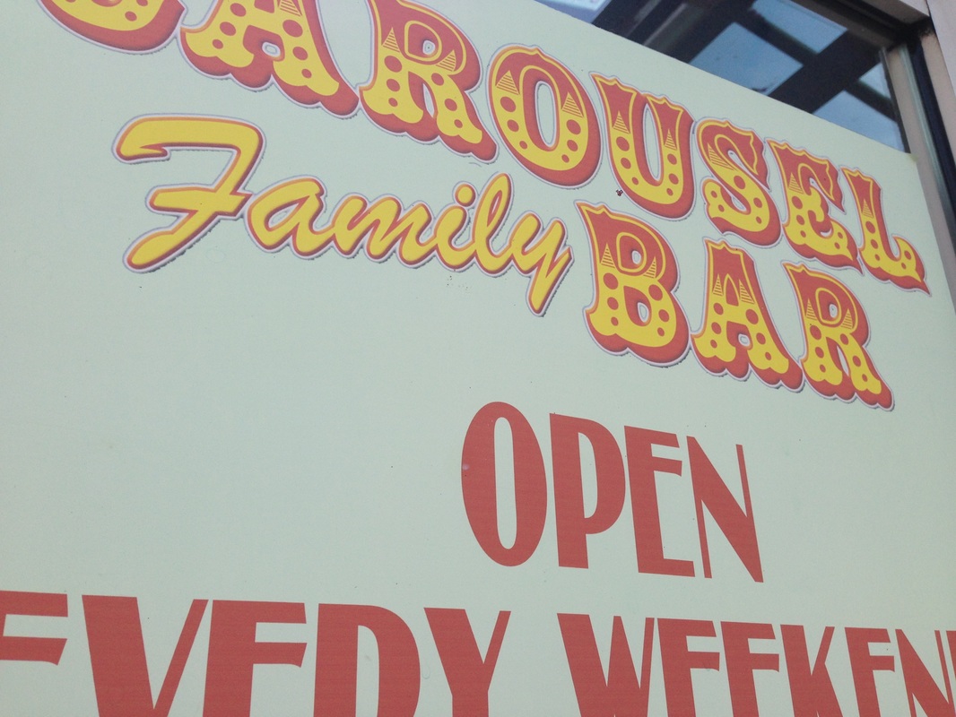
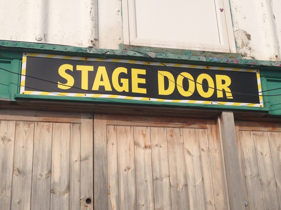
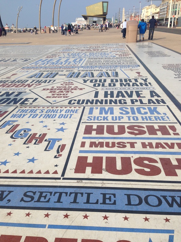
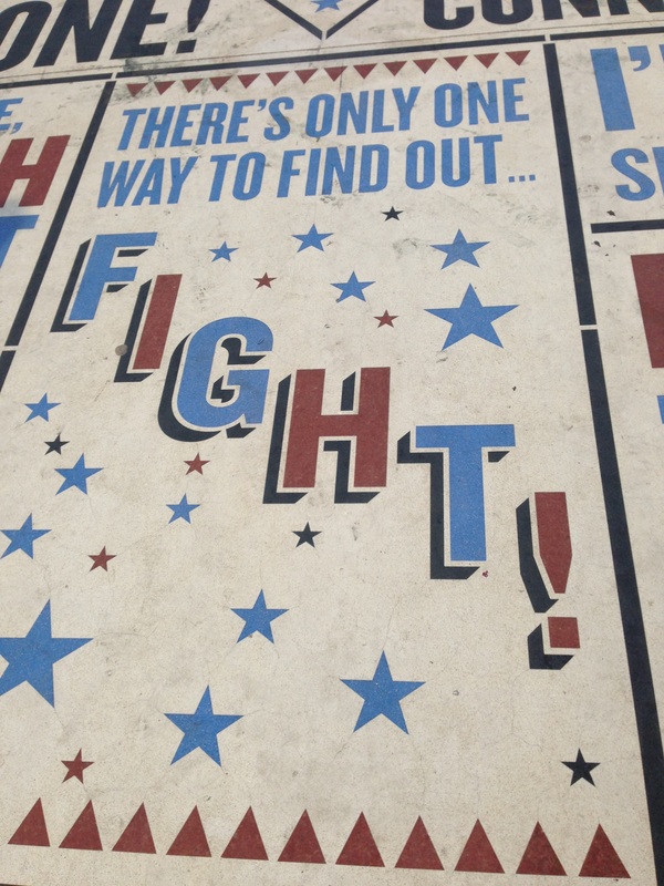
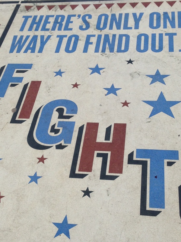
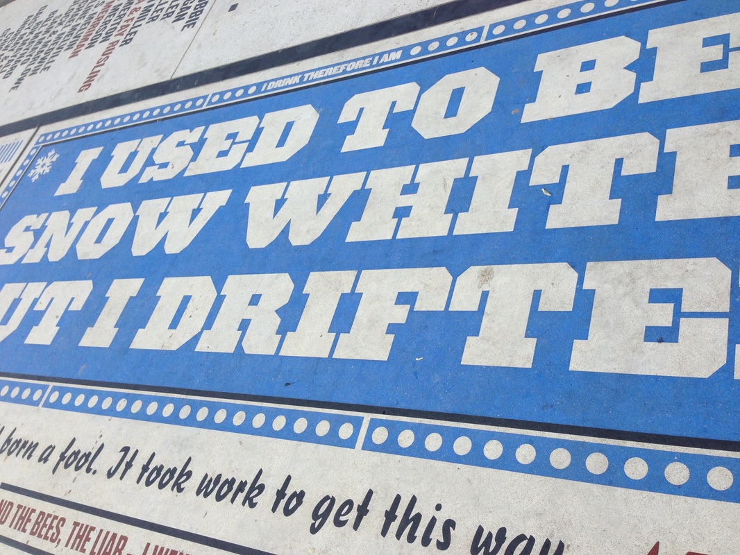
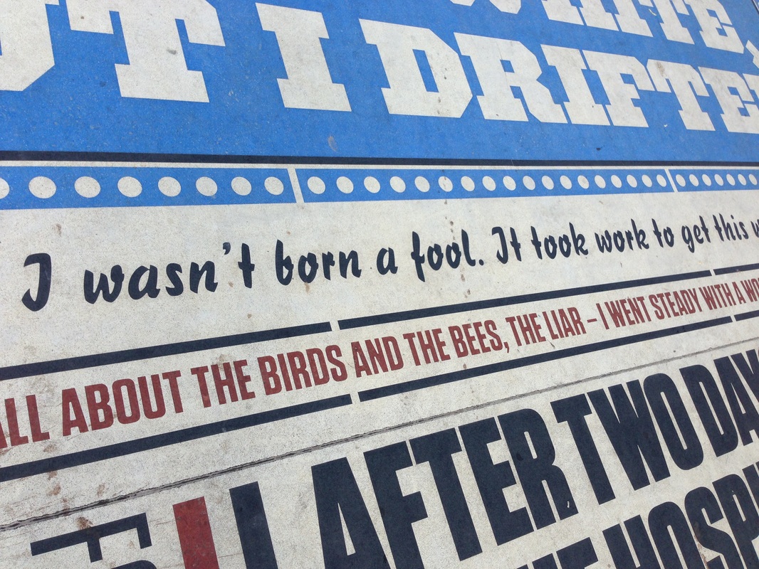
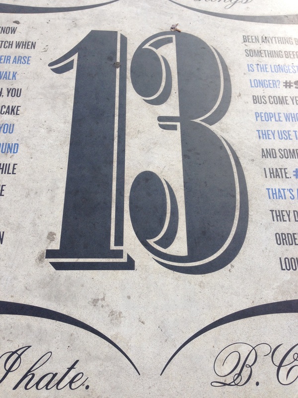
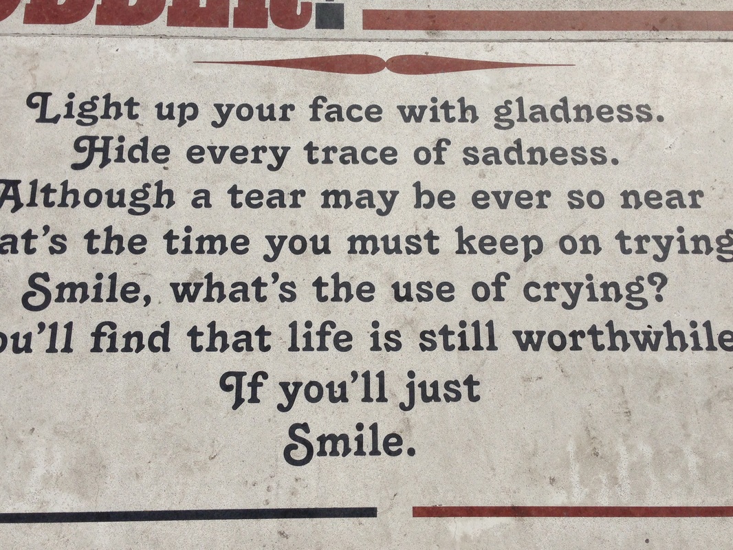
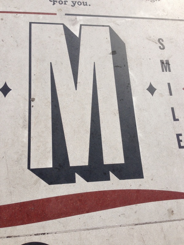
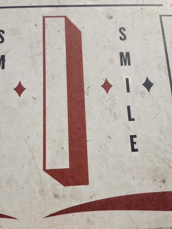
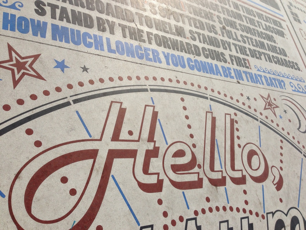
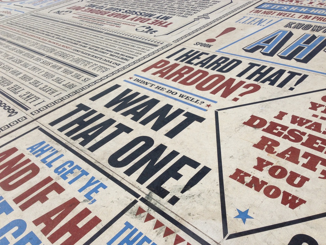
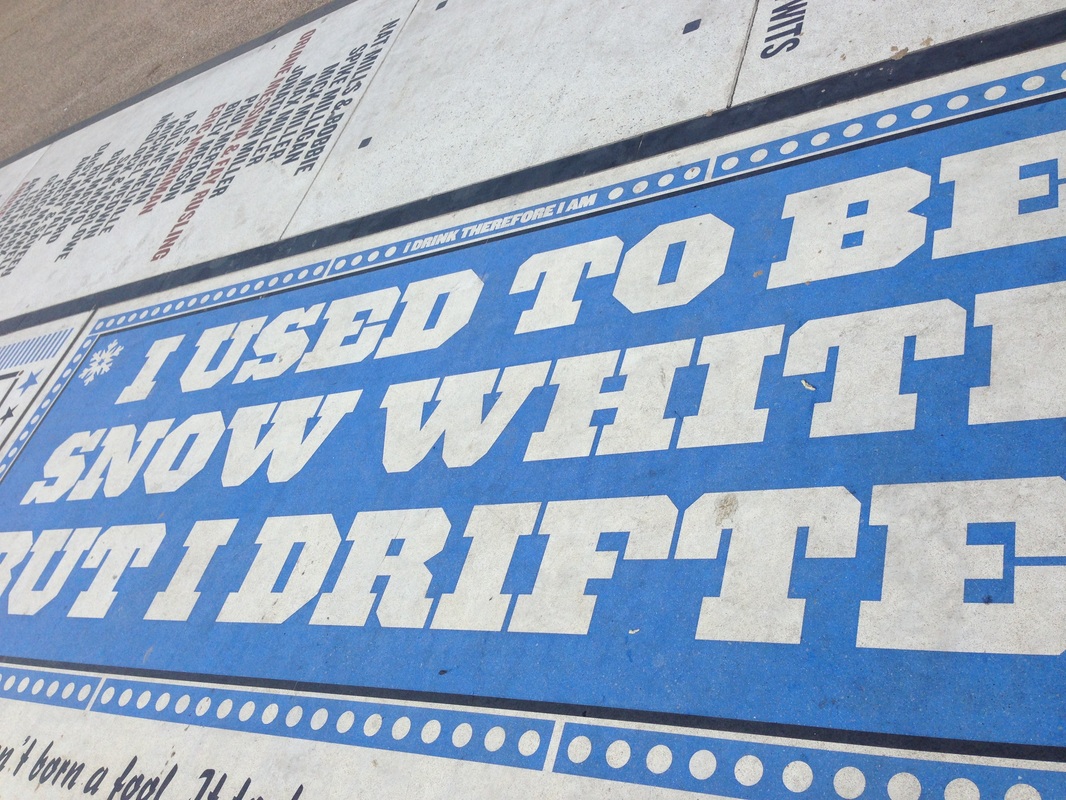
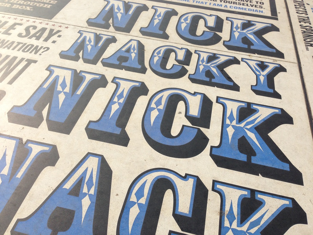
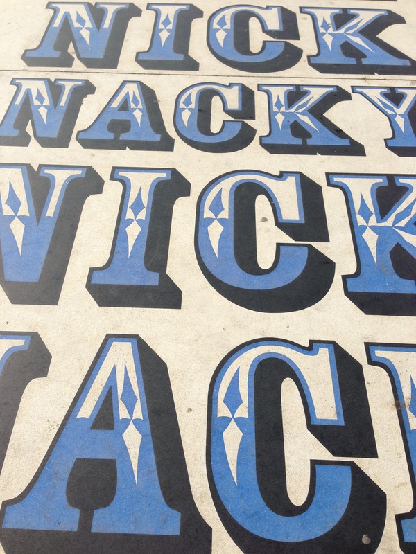
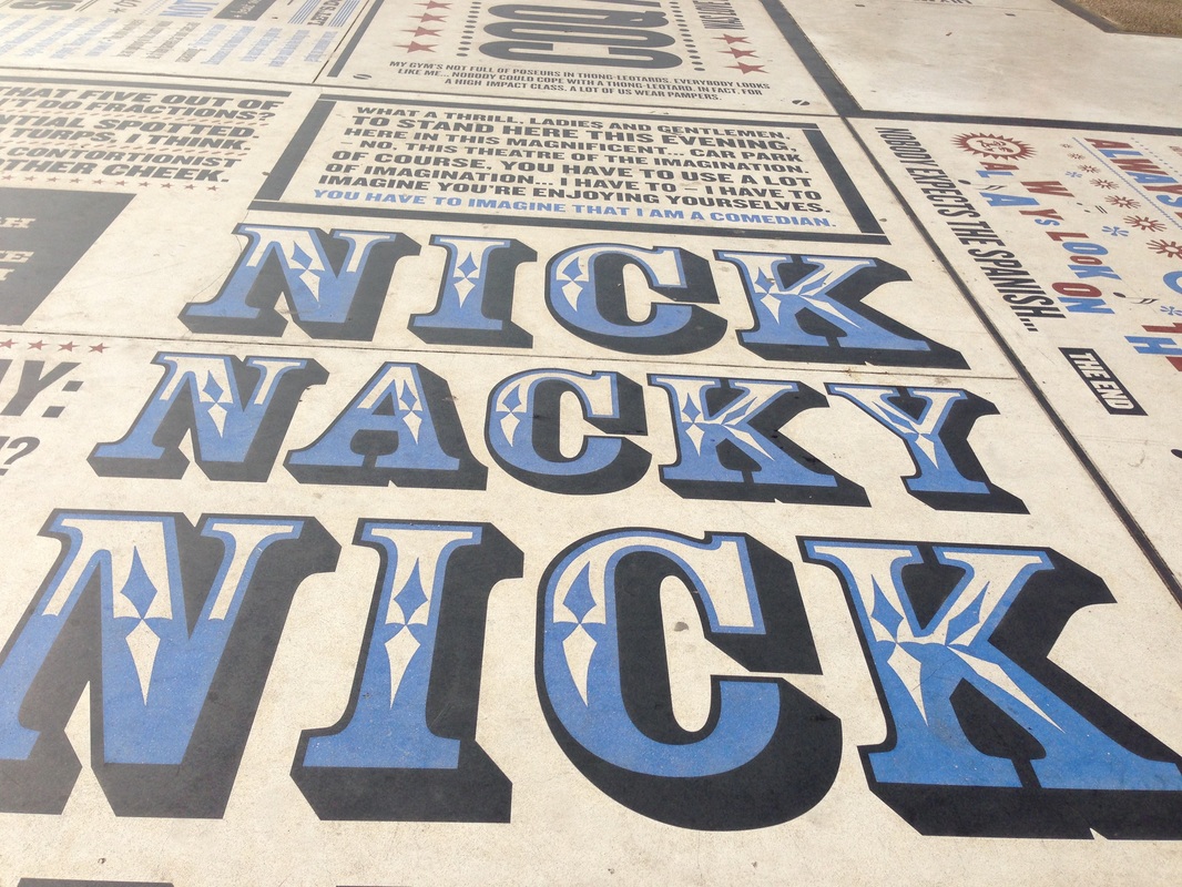
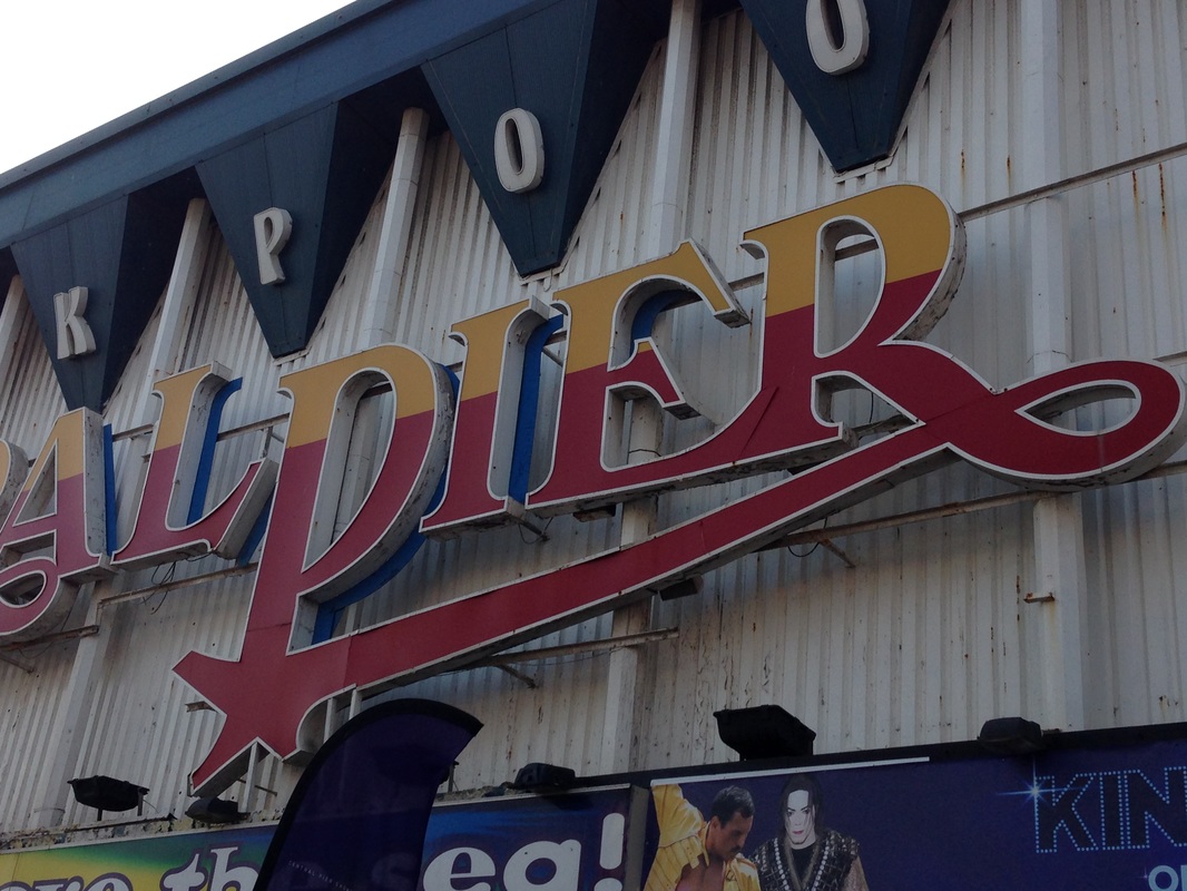
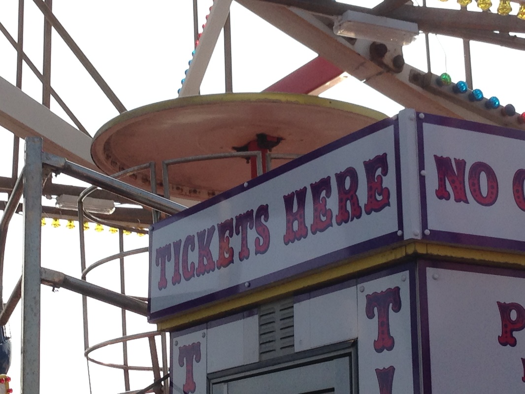
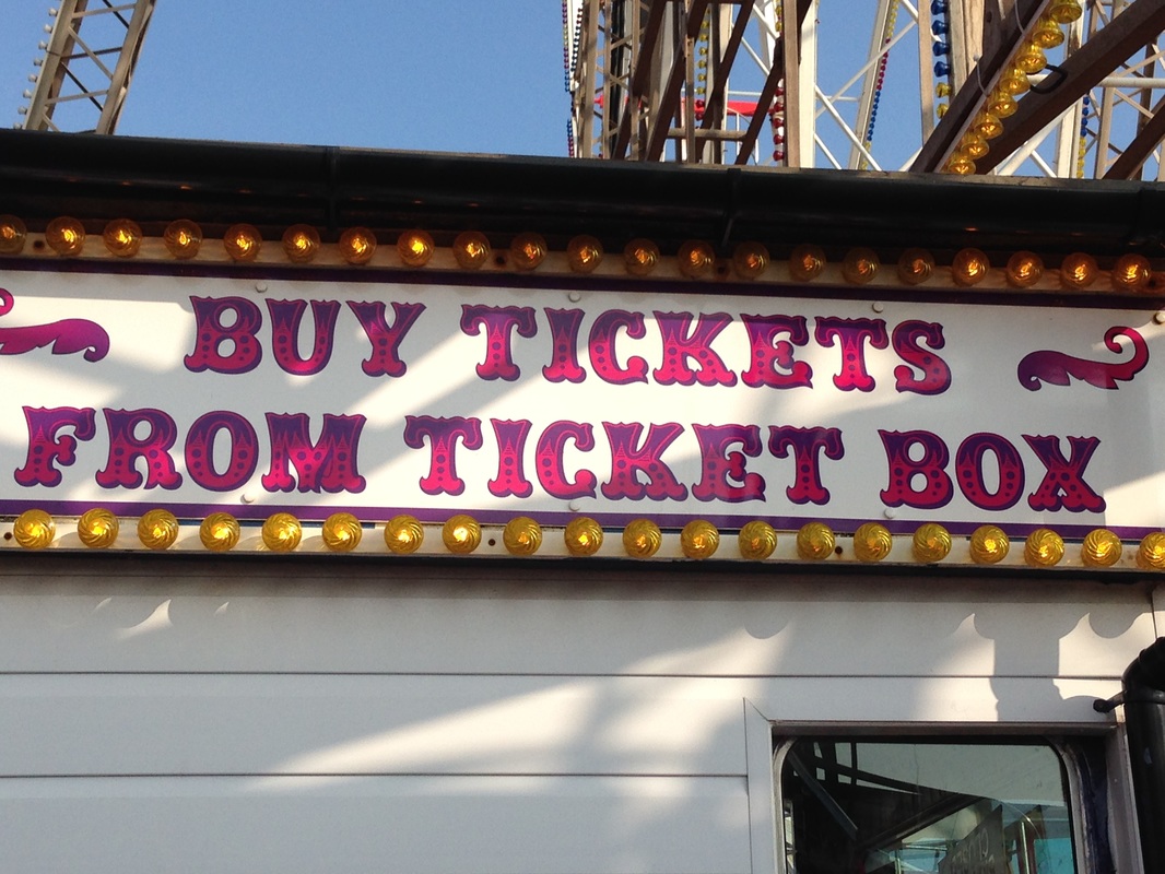
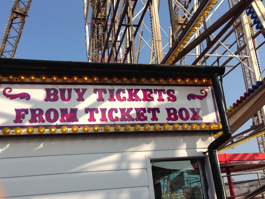
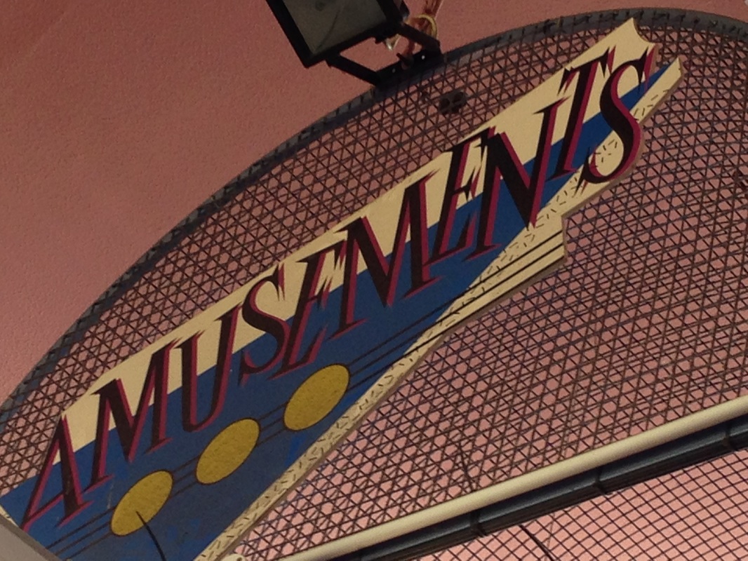
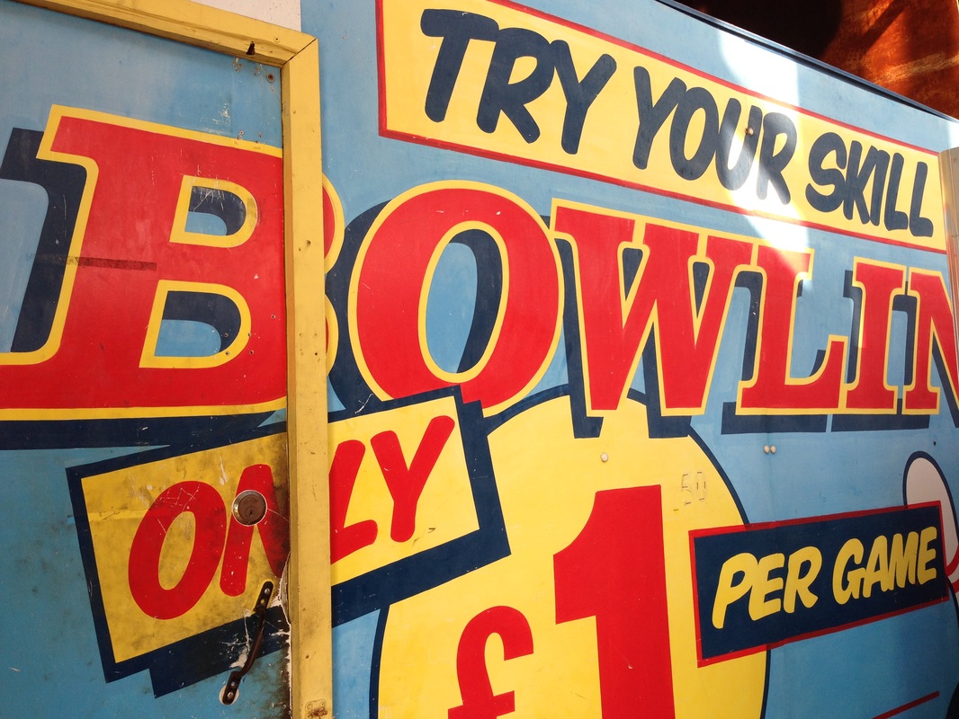
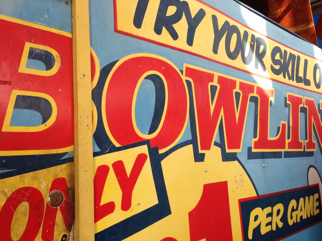
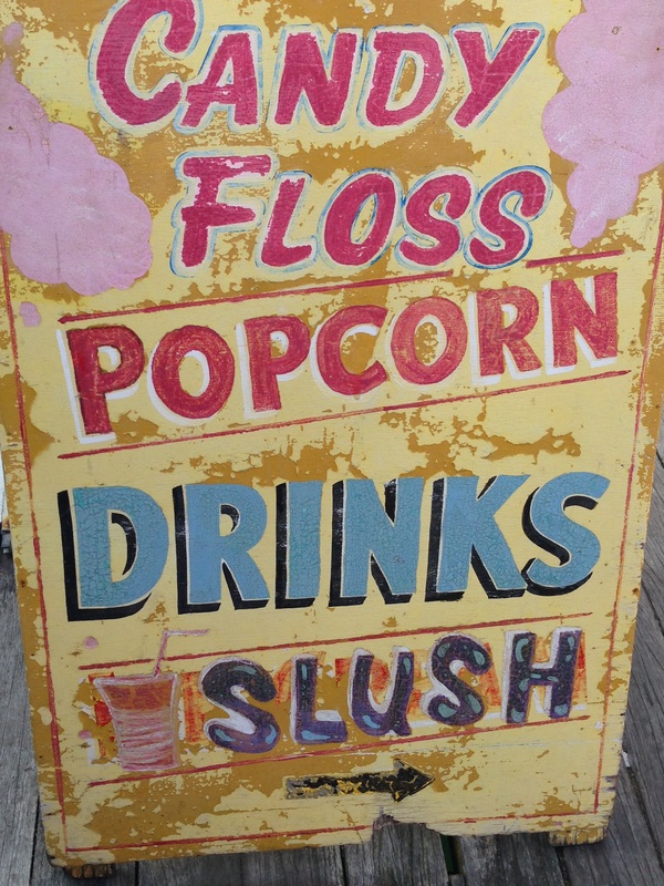
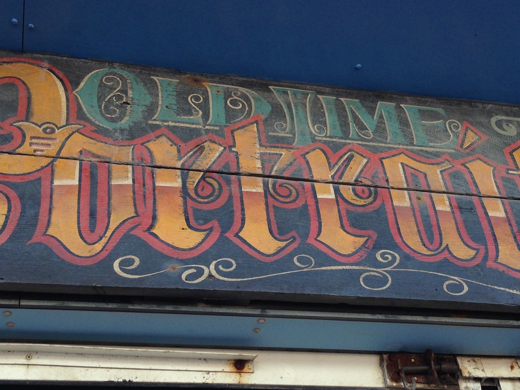
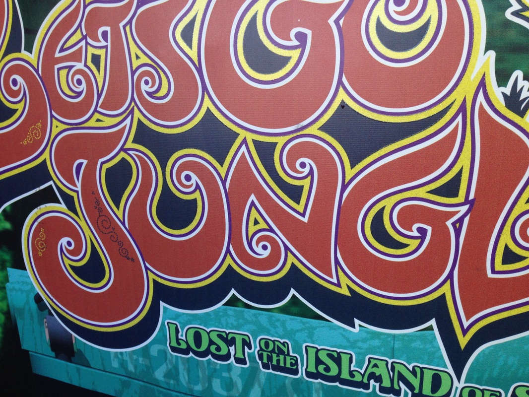
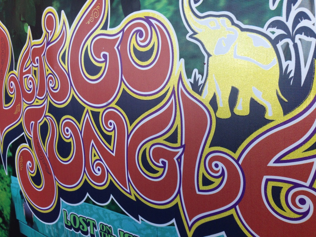
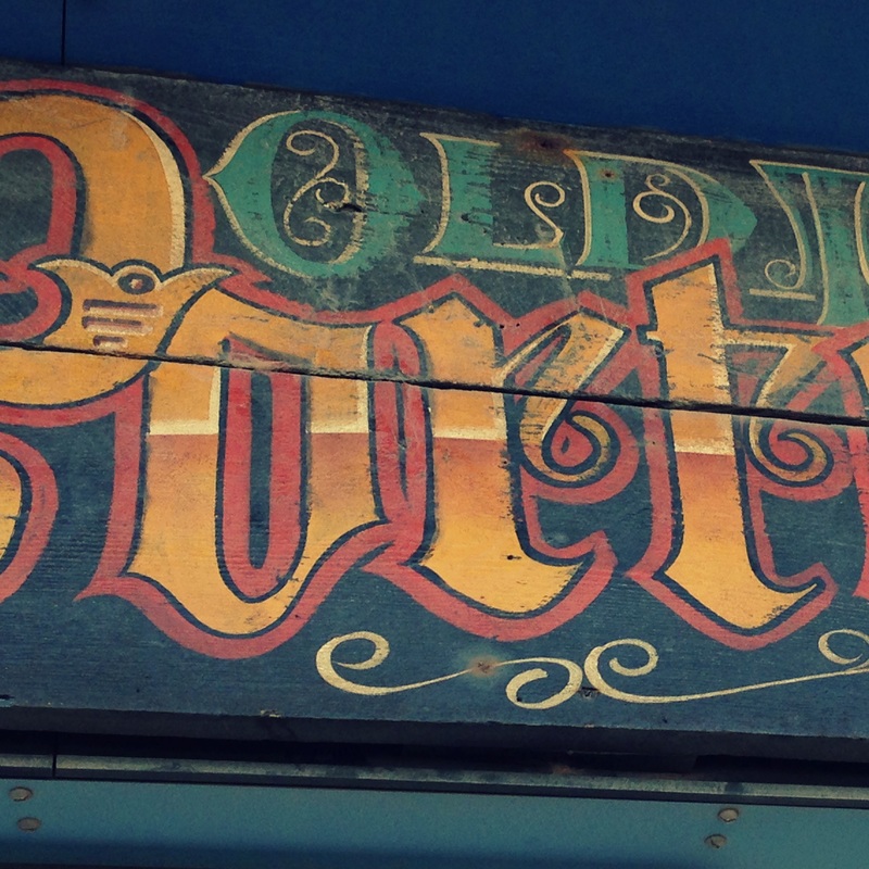
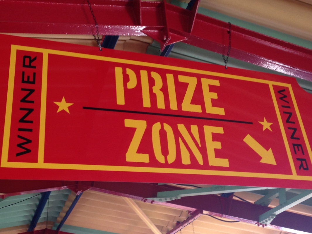
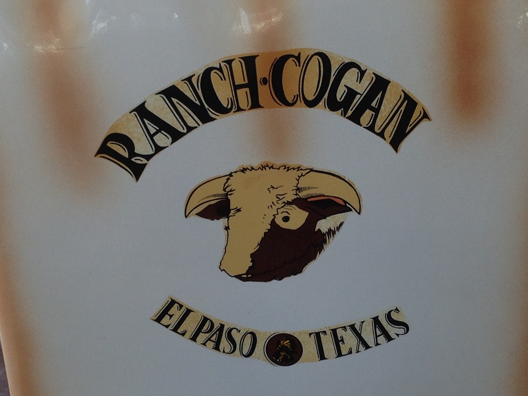
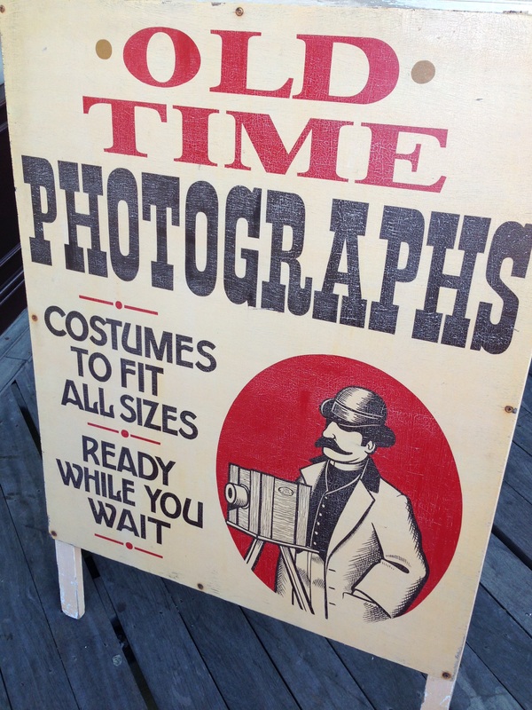
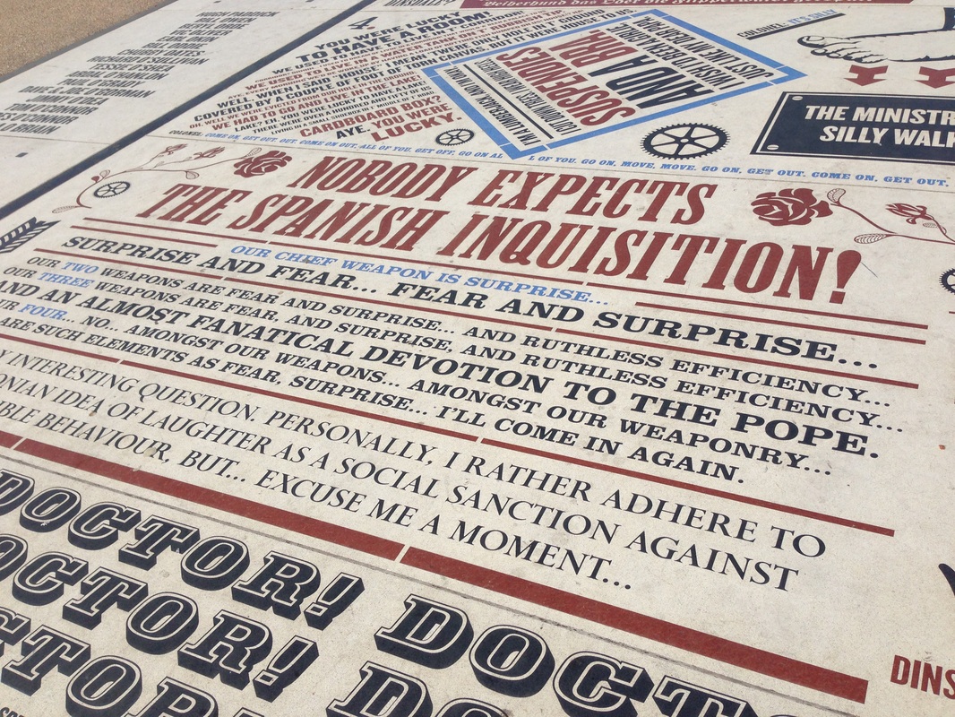
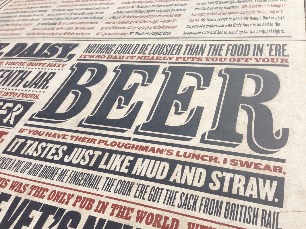
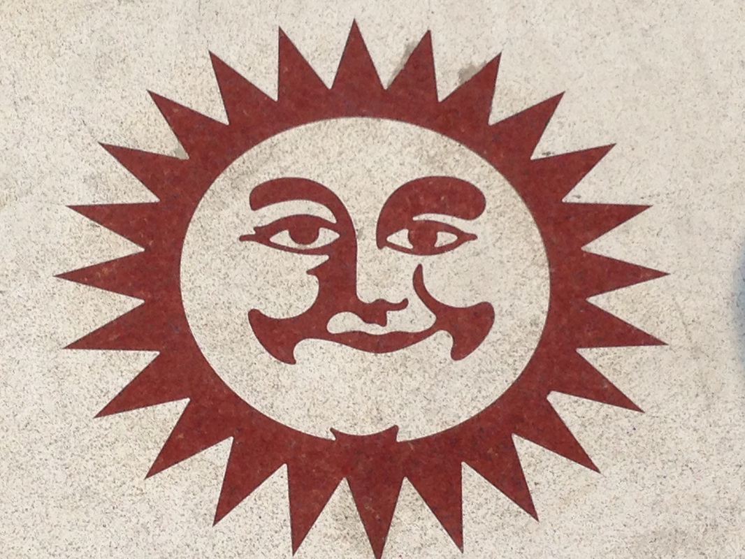
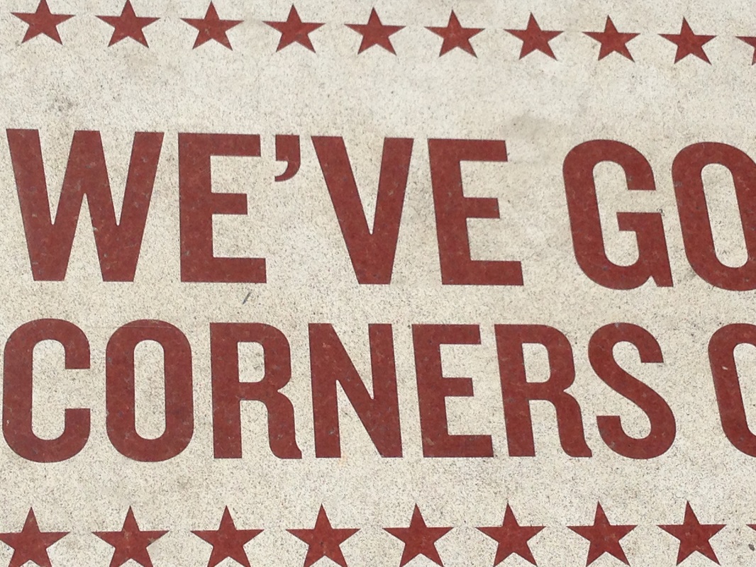
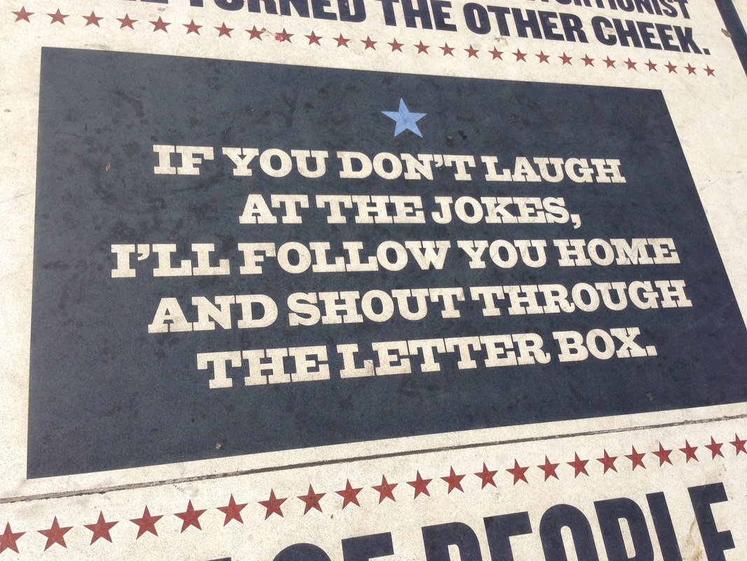
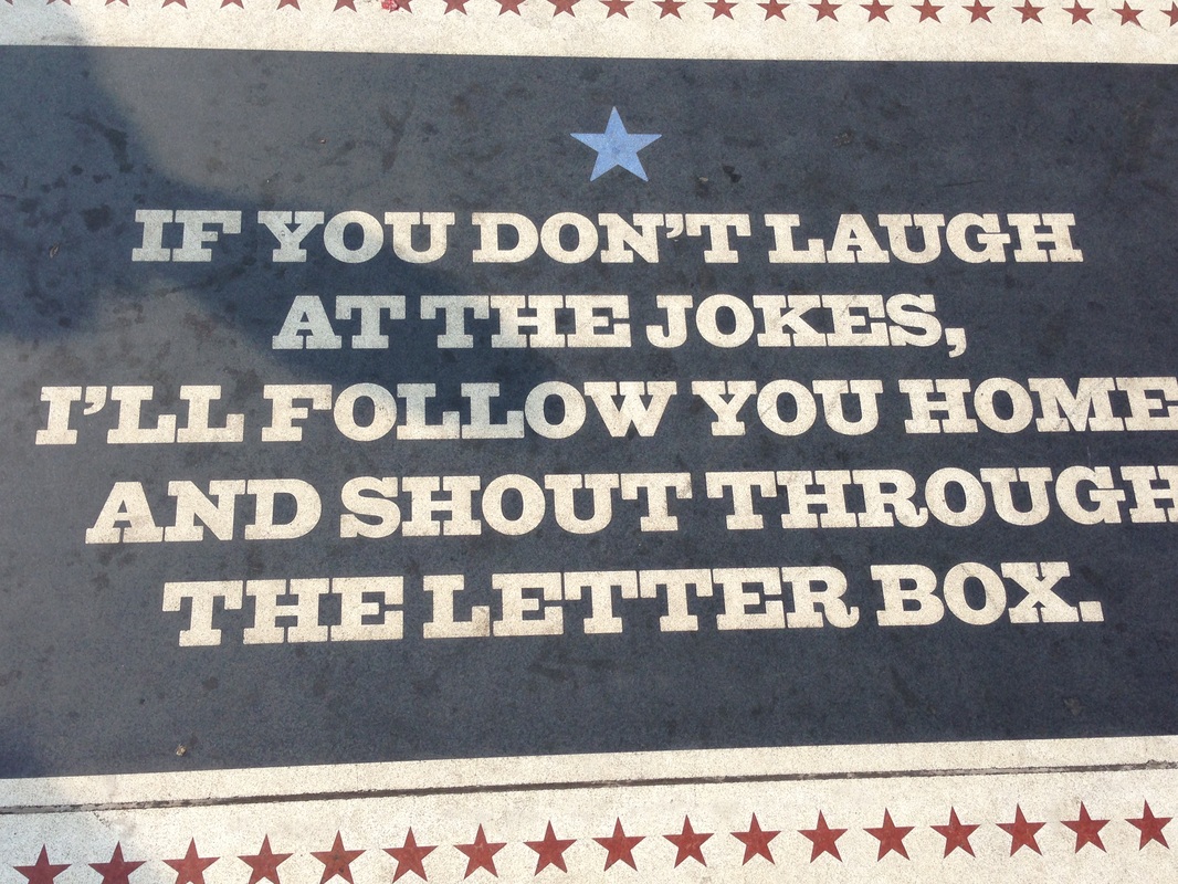
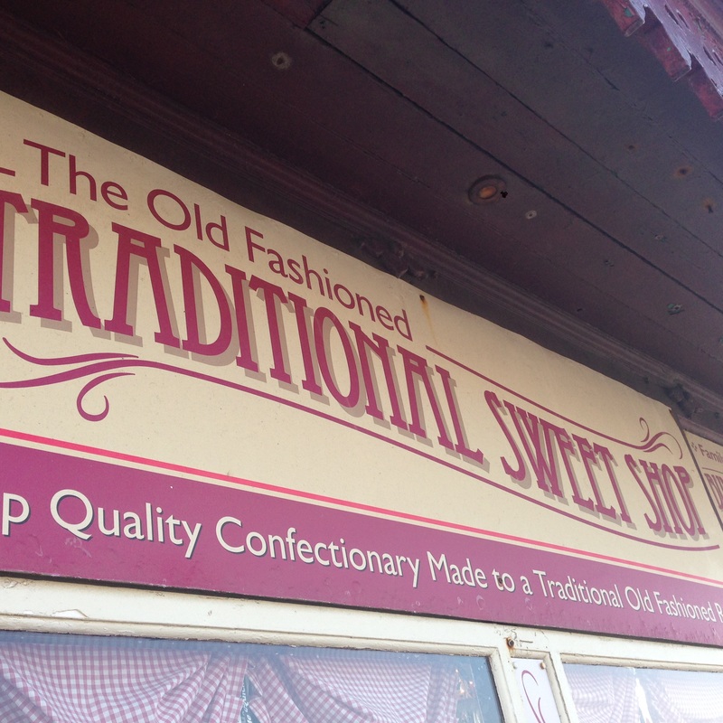
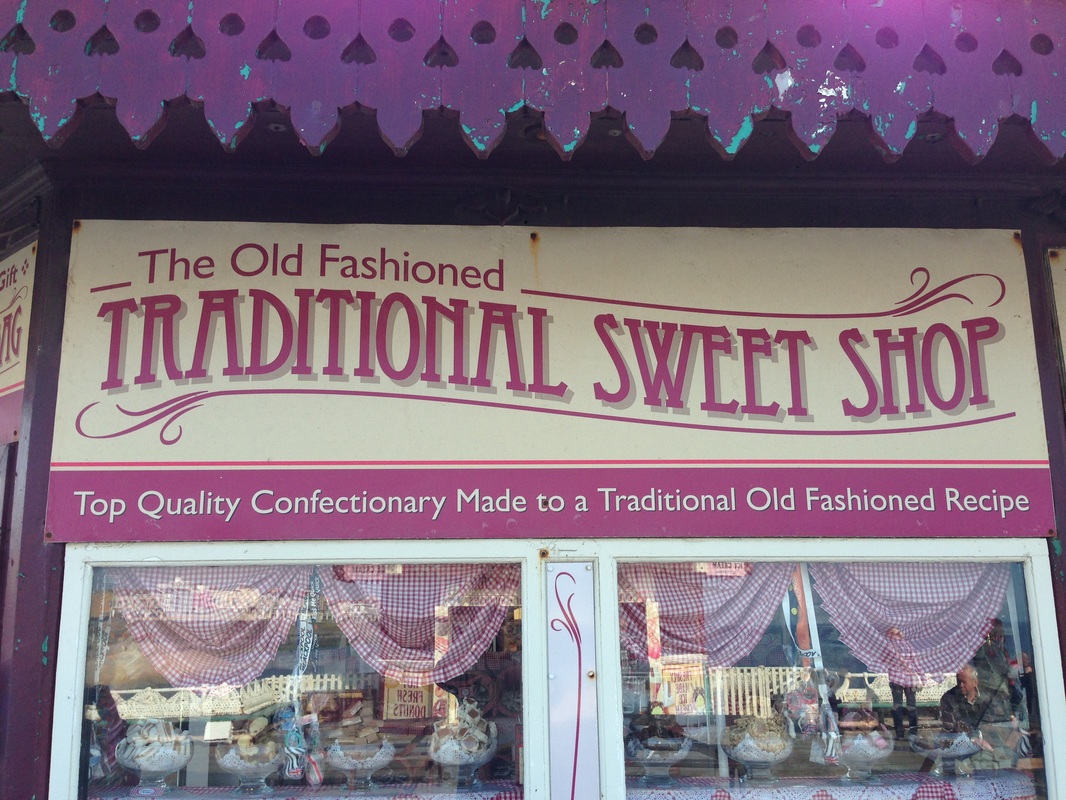
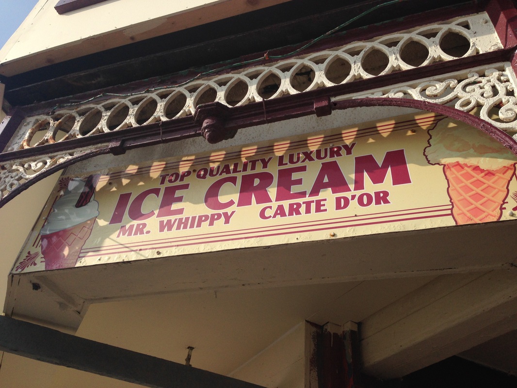
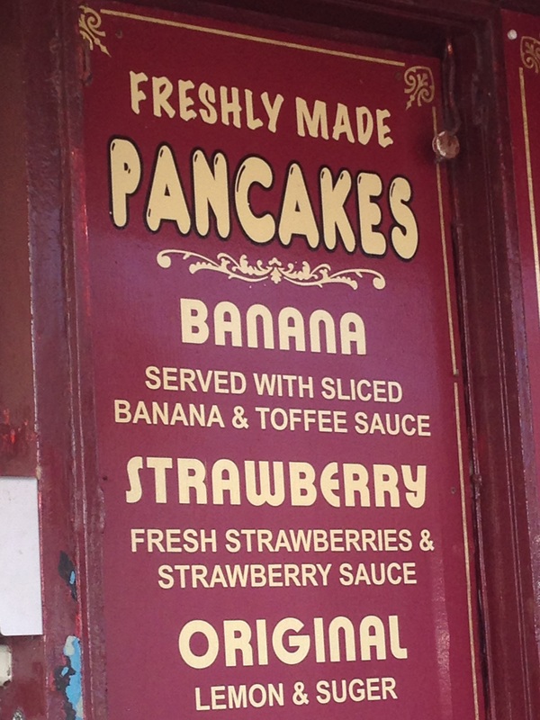
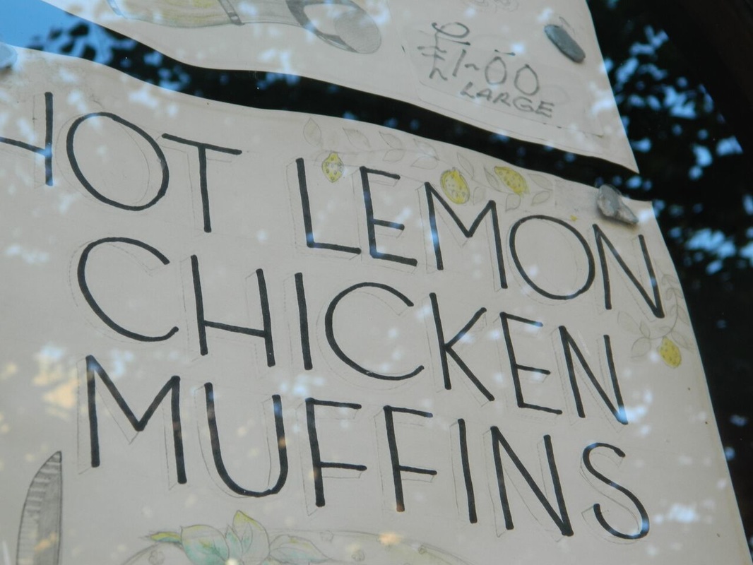
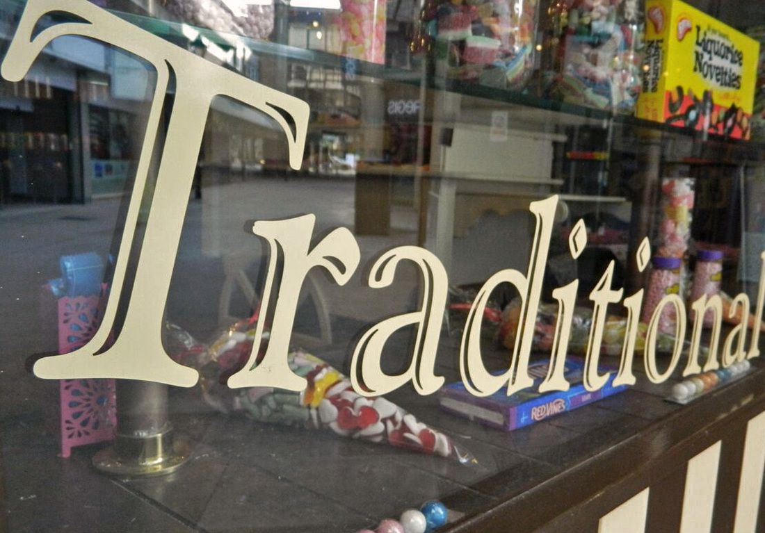
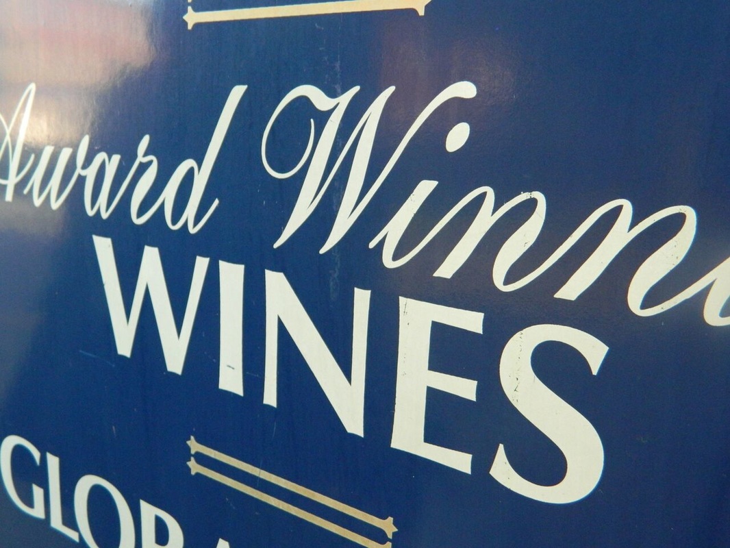
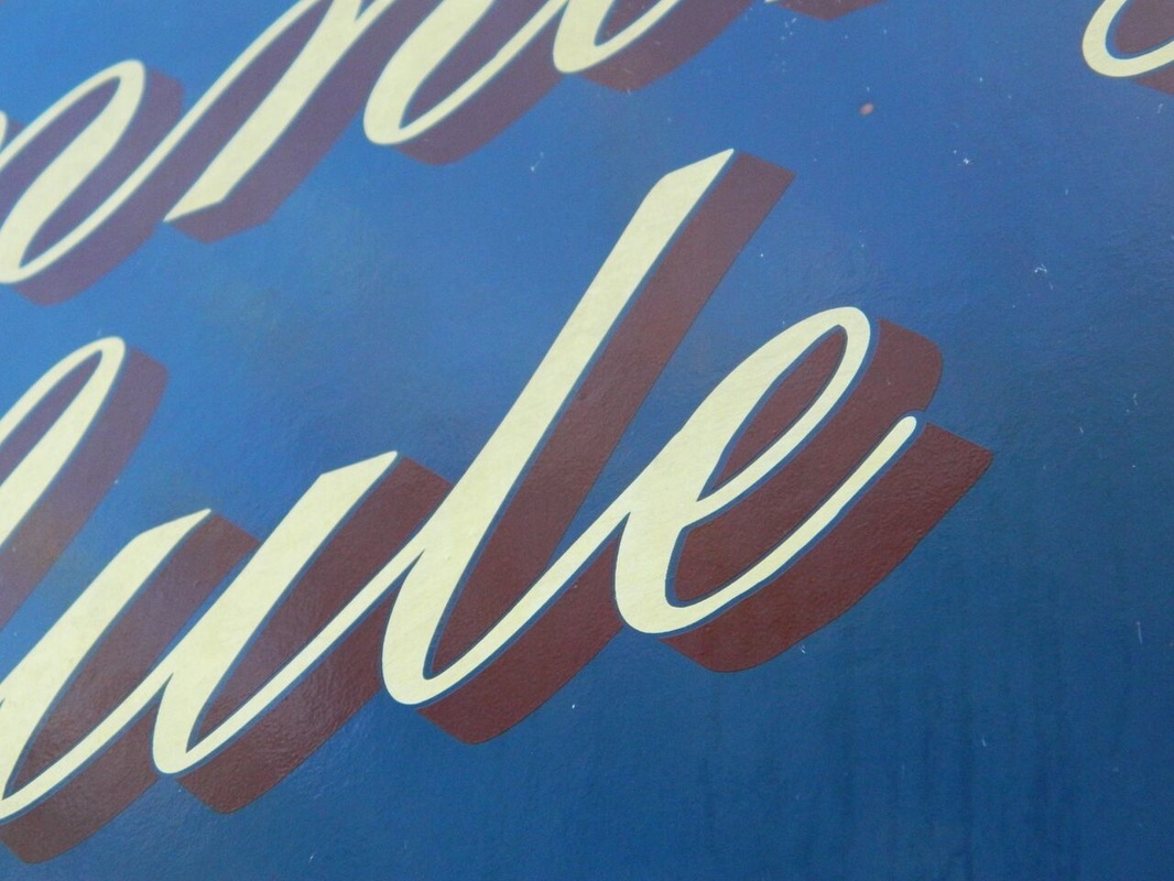
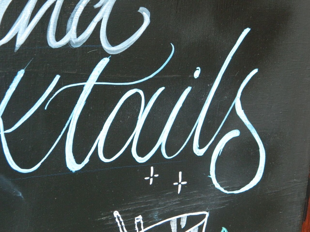
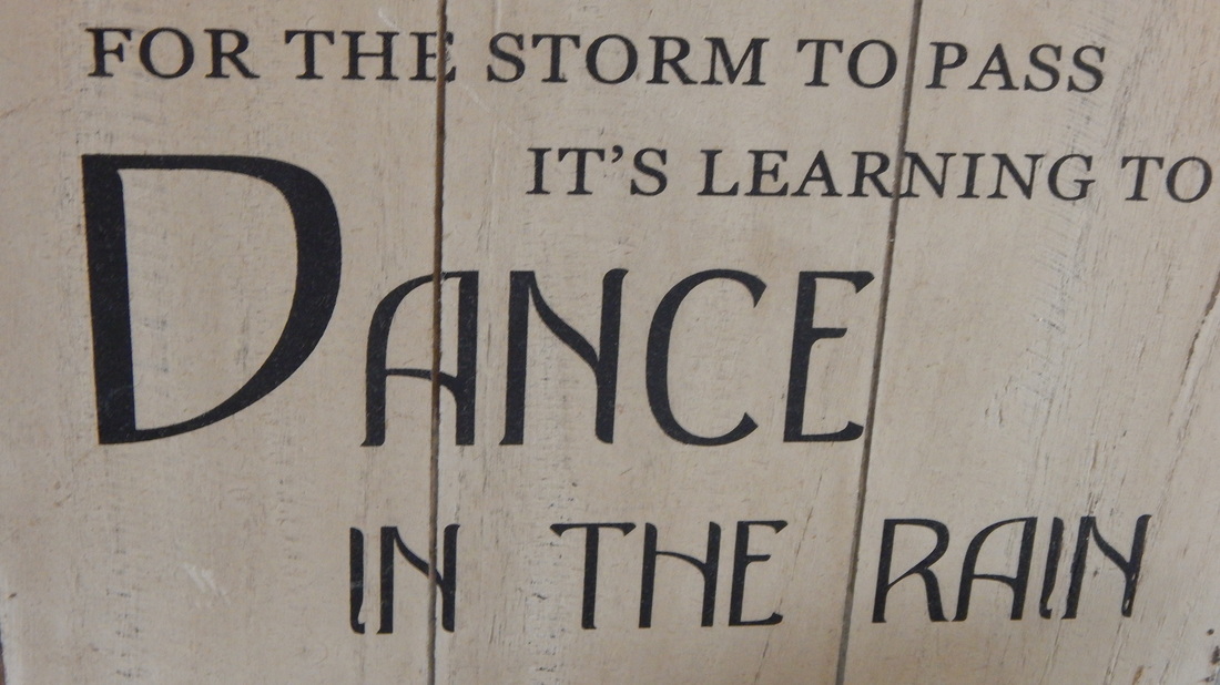
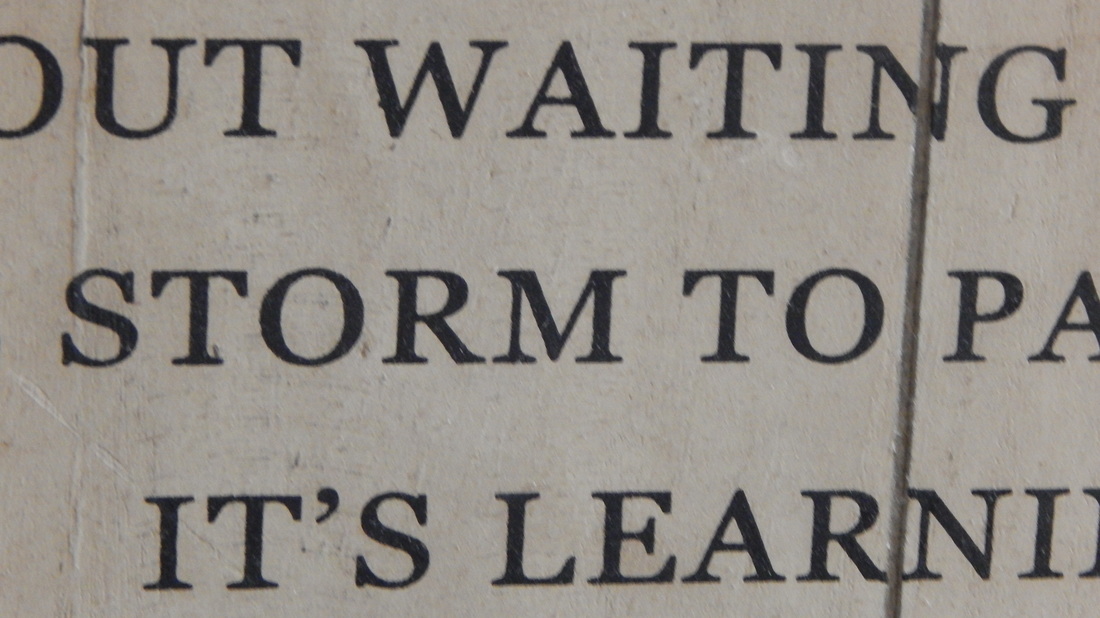
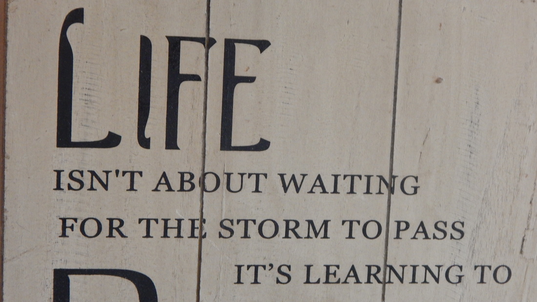
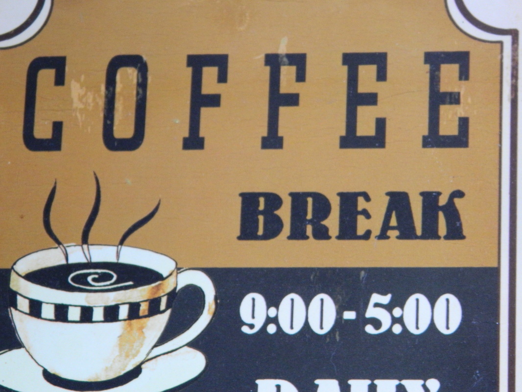
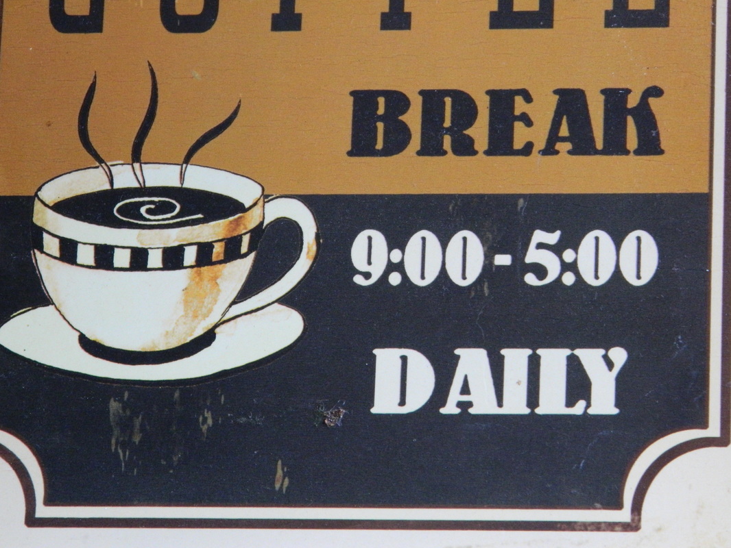
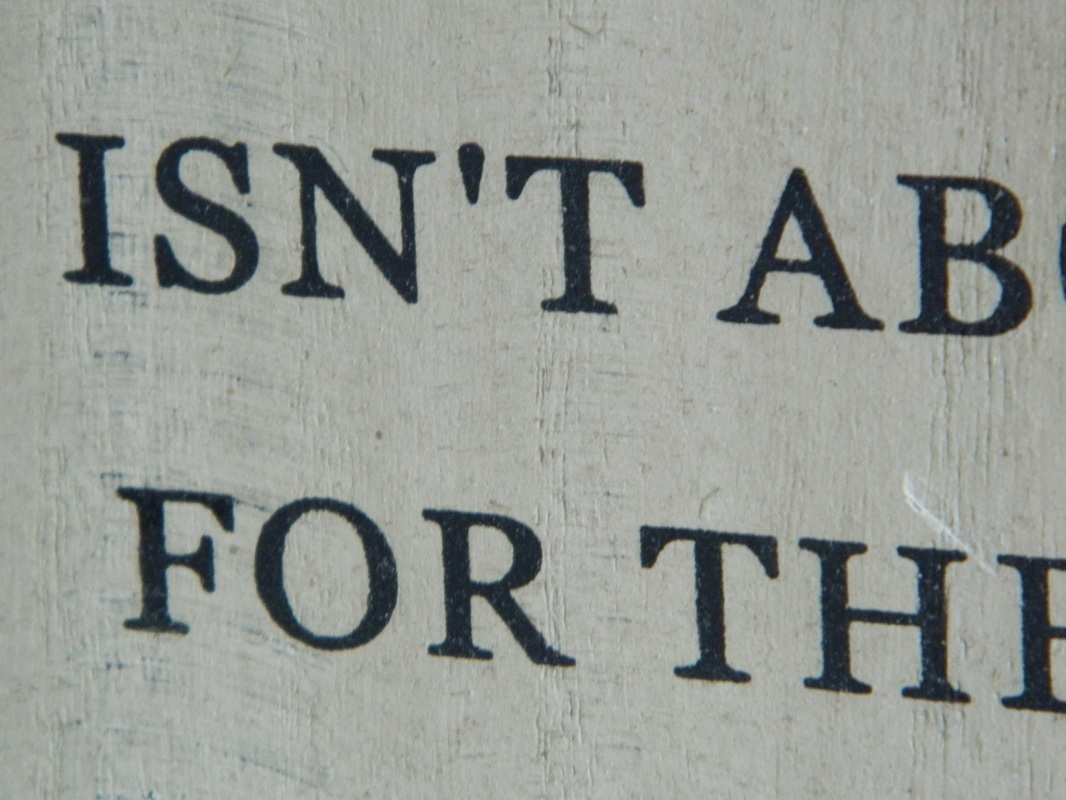
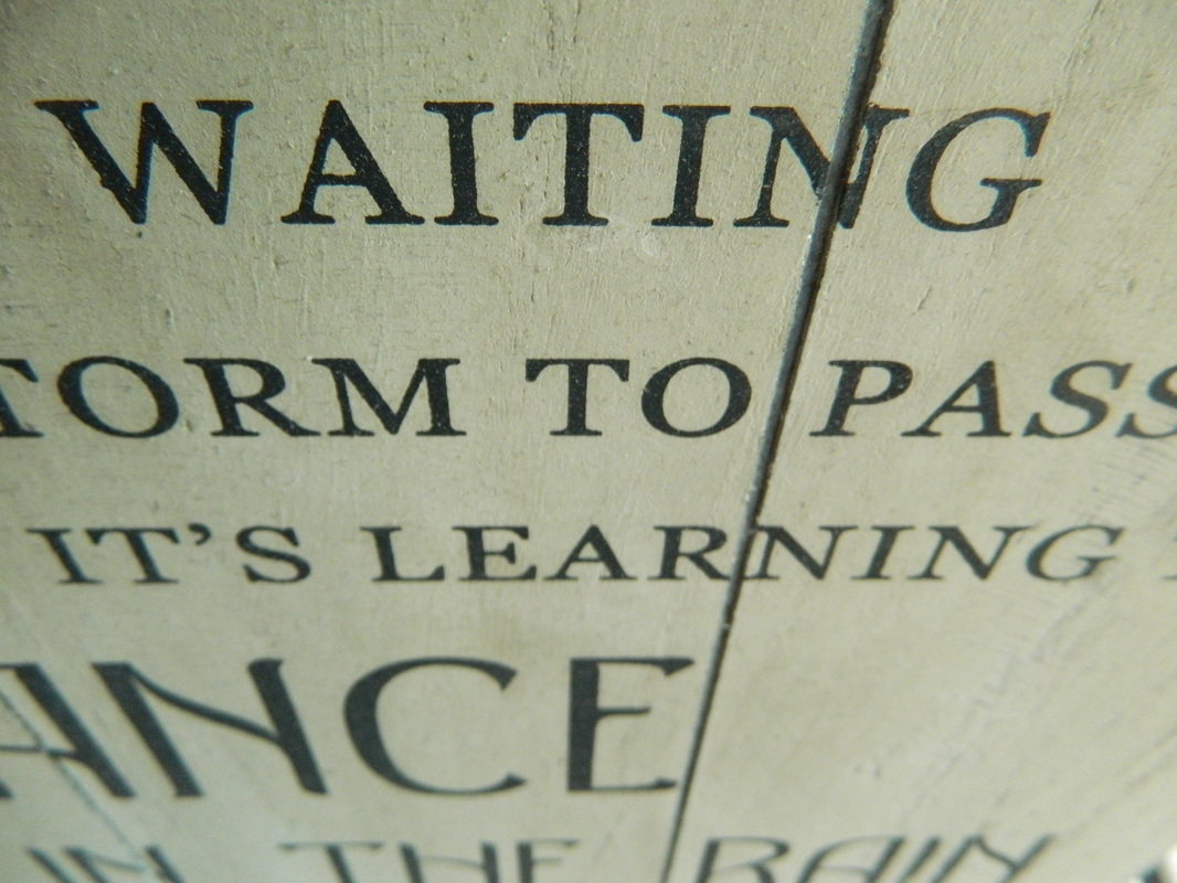
I took this set of photographs on two separate photography trips- one to Blackpool where I captured signage (which is quite carnival/fun fair inspired) from the North and South pier and the attractions which encompass the streets, and on another trip to Bolton town centre where I found old signage from a traditional sweet shop, noticeboards, and menus for restaurants. In Blackpool I came across painted text on the ground, known as the 'Comedy Carpet', which is a set of quotes from comedians and famous figures in different typography, mainly in the colours red, blue, and black. On the first trip I took around 50 photographs, and on the second I took around 100, and selected the ones with a high brightness and no blurriness. I intend to arrange my next trip on a day which is less cloudy, so the lighting for my photographs is more high-key and there are less shadows on the photographs, making them clearer and less grainy. In these photographs I tried to emulate the style of Ed Fella by keeping my subject matter related to the theme for my final piece, which is "Carnival" or "Fun Fair", as Ed Fella does for his own pieces by capturing different texts in different fonts but linking them back together with a common theme. Ed Fella has also done pieces relating to fun fairs when capturing different aspects of America in his pieces, such as an anchor-themed piece. The colour palette for my photographs is mainly blue, red, black, and yellow.
I took this set of photographs on two separate photography trips- one to Blackpool where I captured signage (which is quite carnival/fun fair inspired) from the North and South pier and the attractions which encompass the streets, and on another trip to Bolton town centre where I found old signage from a traditional sweet shop, noticeboards, and menus for restaurants. In Blackpool I came across painted text on the ground, known as the 'Comedy Carpet', which is a set of quotes from comedians and famous figures in different typography, mainly in the colours red, blue, and black. On the first trip I took around 50 photographs, and on the second I took around 100, and selected the ones with a high brightness and no blurriness. I intend to arrange my next trip on a day which is less cloudy, so the lighting for my photographs is more high-key and there are less shadows on the photographs, making them clearer and less grainy. In these photographs I tried to emulate the style of Ed Fella by keeping my subject matter related to the theme for my final piece, which is "Carnival" or "Fun Fair", as Ed Fella does for his own pieces by capturing different texts in different fonts but linking them back together with a common theme. Ed Fella has also done pieces relating to fun fairs when capturing different aspects of America in his pieces, such as an anchor-themed piece. The colour palette for my photographs is mainly blue, red, black, and yellow.
Photograph Contact Sheets
Initial Photographs Set 1