Ella's A-level Photography
  • Home
  • Projects
    • Typography >
      • Artist Reference >
        • Ed Fella
        • Robert Cottingham
        • Molly Woodward
      • Initial Photographs
      • Development >
        • Development Pieces
        • Edited Photographs
      • Final Pieces
    • Reflections >
      • Artist Reference >
        • Mark Hamblin
        • Peter Bendall
        • Hubbert Steed
        • Don Johnston
      • Initial Photographs
      • Development
      • Final Pieces
    • Close-up >
      • Artist Reference >
        • Emoke Szabo
        • Estelle Cadwallader
        • Ingard Jensen
      • Initial Photographs
      • Development
      • Final Piece
    • Double Exposure >
      • Artist Reference >
        • Sara K. Byrne
        • Dan Mountford
        • Christoffer Relander
        • Andreas Lie
        • Aneta Ivanova
      • Initial Photographs >
        • Background photography
      • Development >
        • Development #1
        • Development #2
      • Final Pieces
    • Component 1 Personal Investigation Urban Exploration >
      • Artist Reference >
        • Alan Duggan
        • Sean Galbraith
        • Brandon Davis
        • Matthew Merrett
      • Initial Photographs
      • Development >
        • Development #1
        • Development #2
        • Development #3
      • Final Pieces
      • Urban Exploration essay
    • Campaign Photography (Component 2 Exam AQA) >
      • Artist Reference >
        • Vivian Maier
        • Linda Wisdom
        • Gian Butturini
        • Cas Oorthyuys
      • Initial Photographs >
        • Edited Photographs
      • Development
      • Final Pieces
ELLA'S A-LEVEL PHOTOGRAPHY PORTFOLIO

Ed Fella

Ed Fella Project AO1

Ed Fella Project- Artist Reference A01

14/9/2015

0 Comments

 
Picture
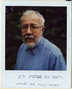
Edward Fella, born in 1938 in Detroit, Michigan, is an American graphic designer and artist, known for his collection of commercial art photographs focusing on typography, usually taken of signs, posters and texts found around urban landscapes. His style is described as 'American Folk Art Typography'. 

He attended Cass Technical High school where he studied lettering, illustration, paste-up and other commercial art techniques. After graduating in 1957, he entered the commercial graphic industry, from where he worked for the next 30 years. His experience in the industry could have influenced the subject matter of his photographs which typically focused on advertisements and posters, and helped him to develop his style and refine his skills.

I like the quirky style and outdated feel that Fella's photographs of cursive lettering and old advertisements bring, with the effects he has used. I also like how his work is completely ambiguous  for the viewer as Fella himself has stated that his work was based on the theory of deconstruction, meaning a piece of writing can be interpreted differently depending on the reader, and he does this by using extreme close-ups of an object or text so only one aspect is shown and the viewer has to decide what meaning is trying to be conveyed in the photo.

In his project "Letters to America", which was taken using a polaroid camera, Fella shows aspects of America through different themes in each of his collections- for example its history, travel and the navy, commercial products and brands, etc.

Picture
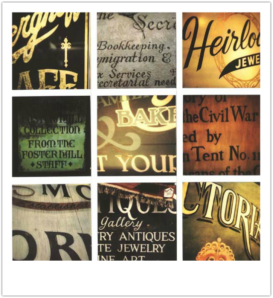
I think it's interesting how each of Fella's projects have a different theme which the photographs are based on, with the typography and the text reflecting the theme. For example, the selection above are based on antiques- such as old jewelry or books, and are of the text on signs, packaging and books with a very cursive, old-fashioned font. I like the retro-style filter used on the photographs, because I think it links to the historical aspect as it gives the photographs an old, yellowed feel and a warmer tone which I think makes them more visually pleasing.
Picture
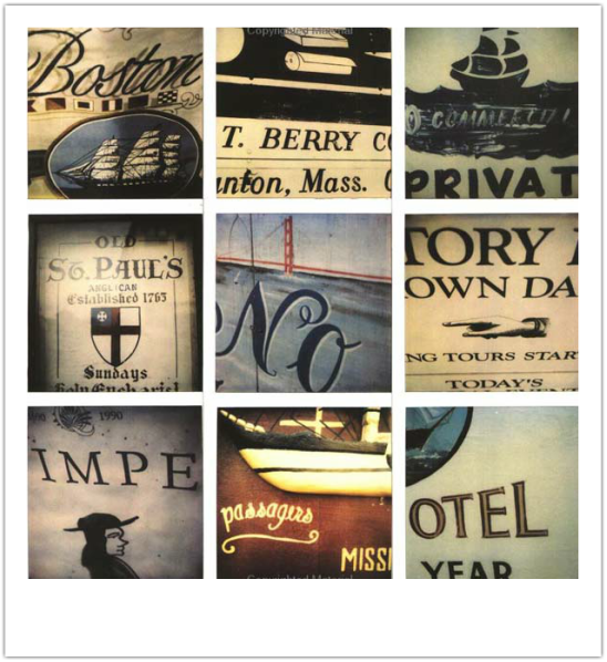
The scale of the photographs is very big and the angle is quite distorted in order to play with the lighting to create shadows, and the images are close-up to make the text used in each photograph seem more ambiguous. This is also done by using a dark blurred edge on each photograph to make them seem more mysterious. I like how the cursive text in the images links to the old-fashioned  'anchor' theme of the photographs.
Picture
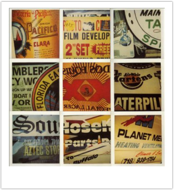
These photographs also have a warm tone, but the text is more bold and modern, so it could be reflecting America in the 1970'-1990s, with newspaper articles, magazines, and advertisements.
Picture
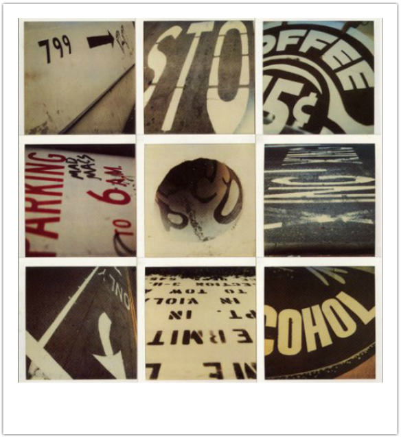
I don't like this piece of Ed Fella's because the photographs are not very clear, and the lack of colour doesn't make the piece very visually pleasing. I also think its not a very good selection of images because the piece is too ambiguous as its hard what to find what the context of the images is.
0 Comments

    Author

    My name's Ella and I'm a 16 year old studying Art Photography at A-Level. This is my portfolio!

    Archives

    September 2015

    Categories

    All

    RSS Feed

Powered by Create your own unique website with customizable templates.
  • Home
  • Projects
    • Typography >
      • Artist Reference >
        • Ed Fella
        • Robert Cottingham
        • Molly Woodward
      • Initial Photographs
      • Development >
        • Development Pieces
        • Edited Photographs
      • Final Pieces
    • Reflections >
      • Artist Reference >
        • Mark Hamblin
        • Peter Bendall
        • Hubbert Steed
        • Don Johnston
      • Initial Photographs
      • Development
      • Final Pieces
    • Close-up >
      • Artist Reference >
        • Emoke Szabo
        • Estelle Cadwallader
        • Ingard Jensen
      • Initial Photographs
      • Development
      • Final Piece
    • Double Exposure >
      • Artist Reference >
        • Sara K. Byrne
        • Dan Mountford
        • Christoffer Relander
        • Andreas Lie
        • Aneta Ivanova
      • Initial Photographs >
        • Background photography
      • Development >
        • Development #1
        • Development #2
      • Final Pieces
    • Component 1 Personal Investigation Urban Exploration >
      • Artist Reference >
        • Alan Duggan
        • Sean Galbraith
        • Brandon Davis
        • Matthew Merrett
      • Initial Photographs
      • Development >
        • Development #1
        • Development #2
        • Development #3
      • Final Pieces
      • Urban Exploration essay
    • Campaign Photography (Component 2 Exam AQA) >
      • Artist Reference >
        • Vivian Maier
        • Linda Wisdom
        • Gian Butturini
        • Cas Oorthyuys
      • Initial Photographs >
        • Edited Photographs
      • Development
      • Final Pieces