Photography Development
Campaign Photography Experimental Editing/
AQA Exam
AQA Exam
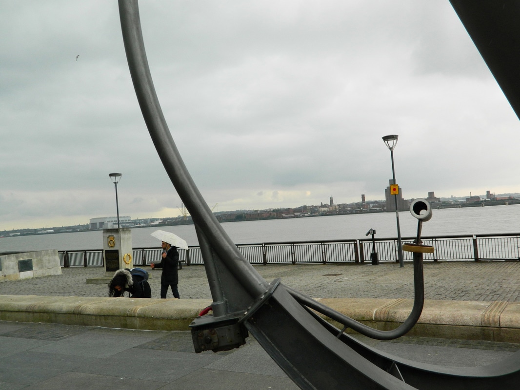
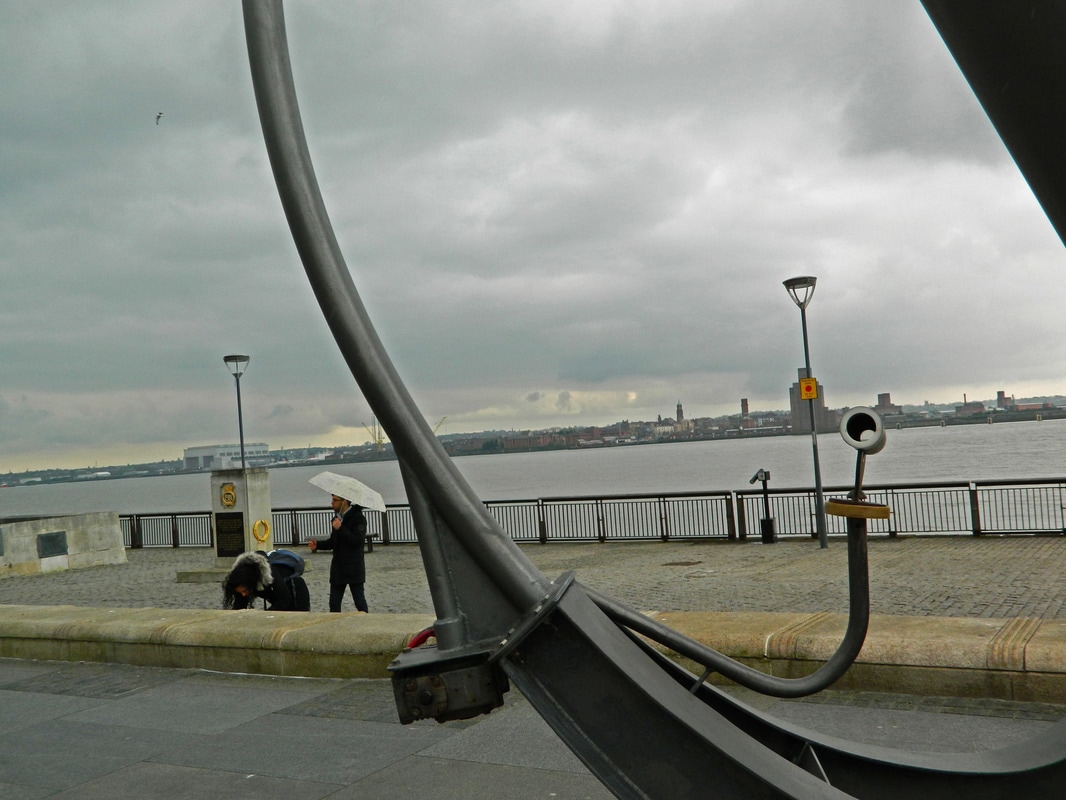
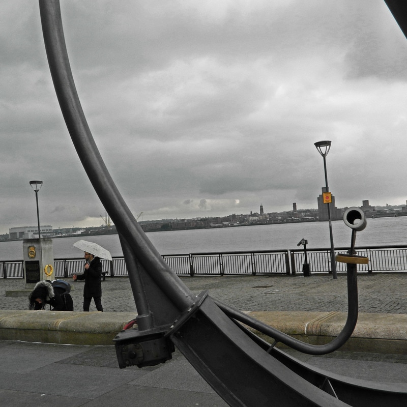
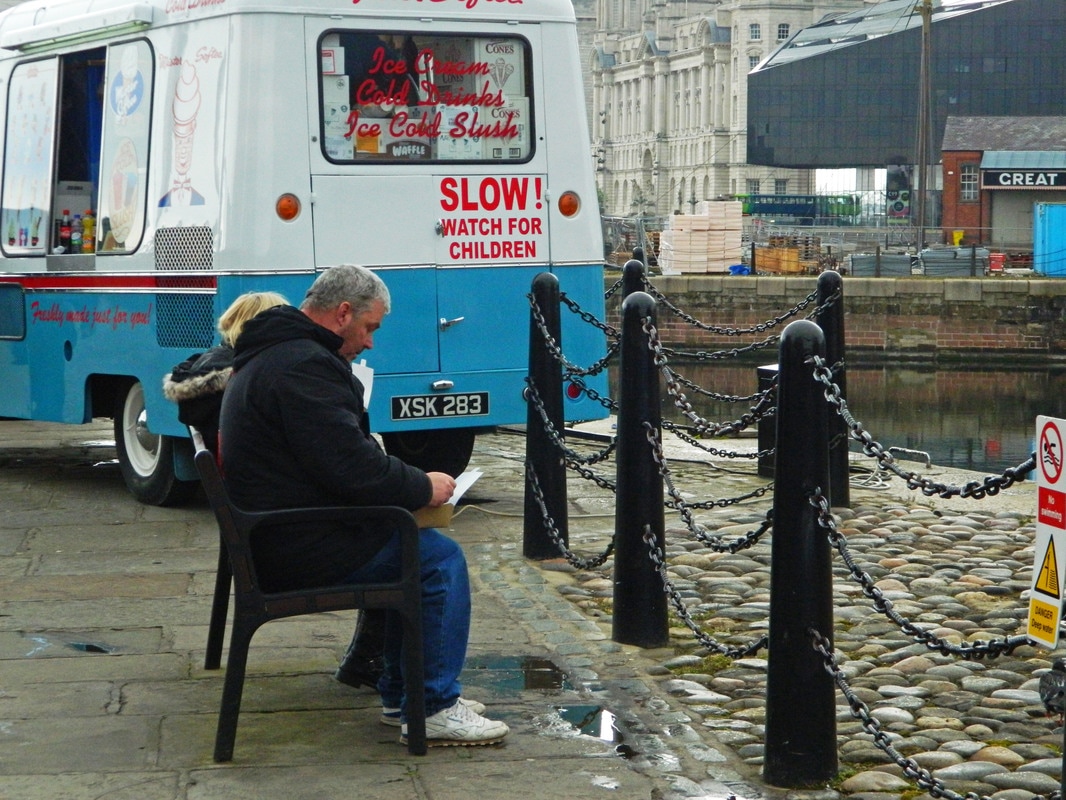
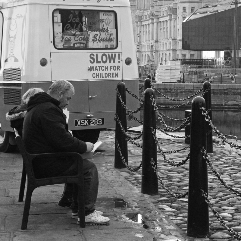
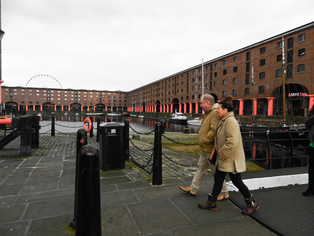
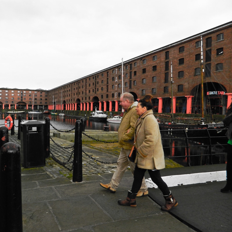
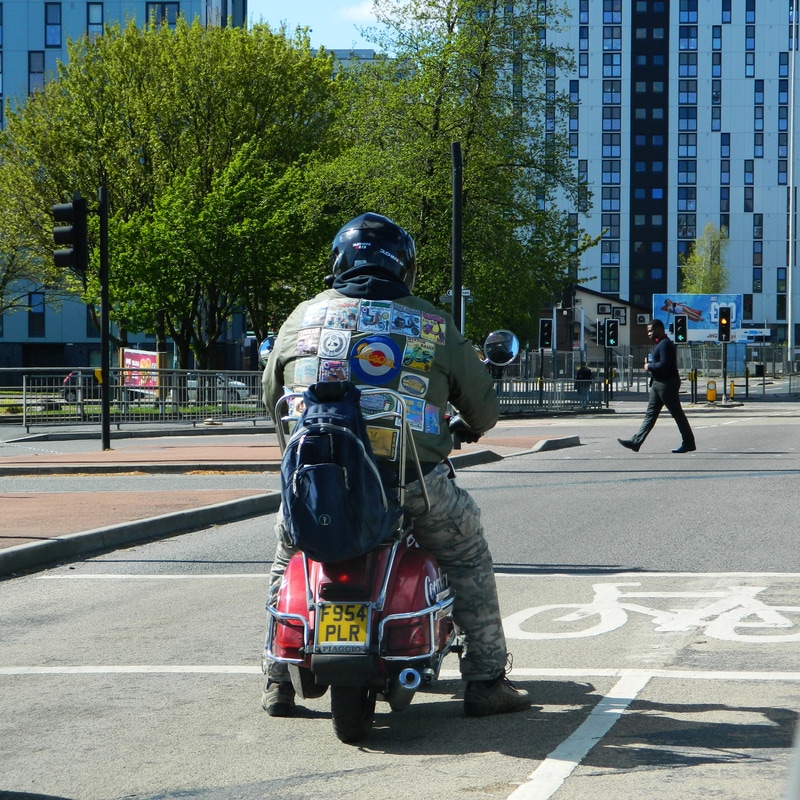
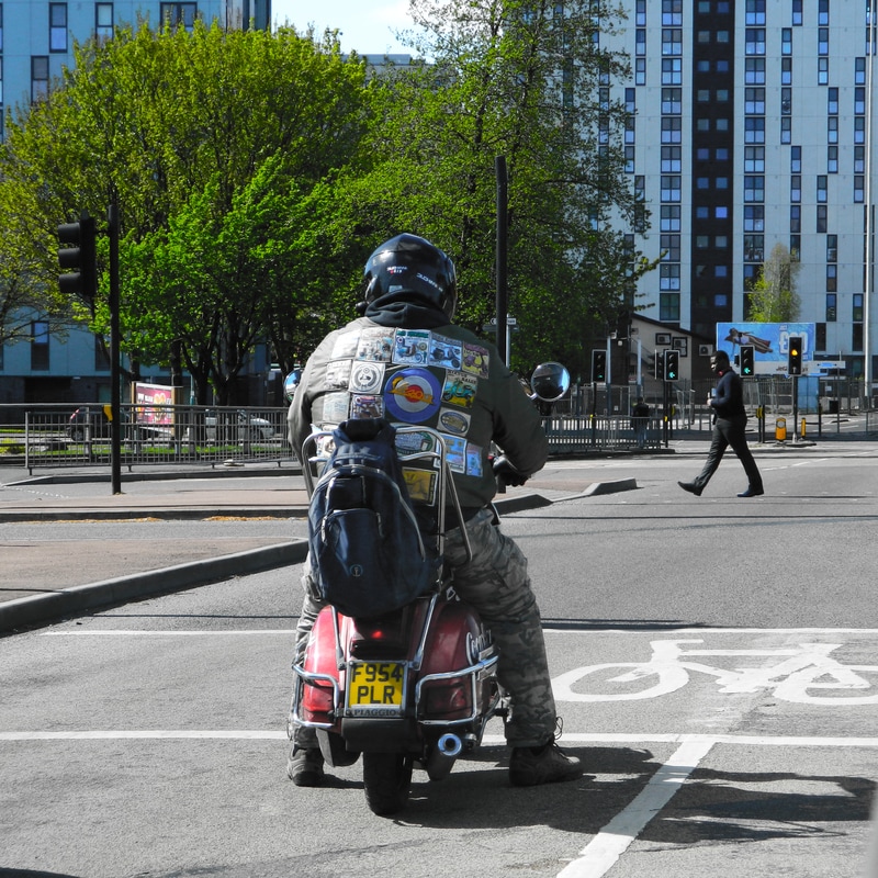
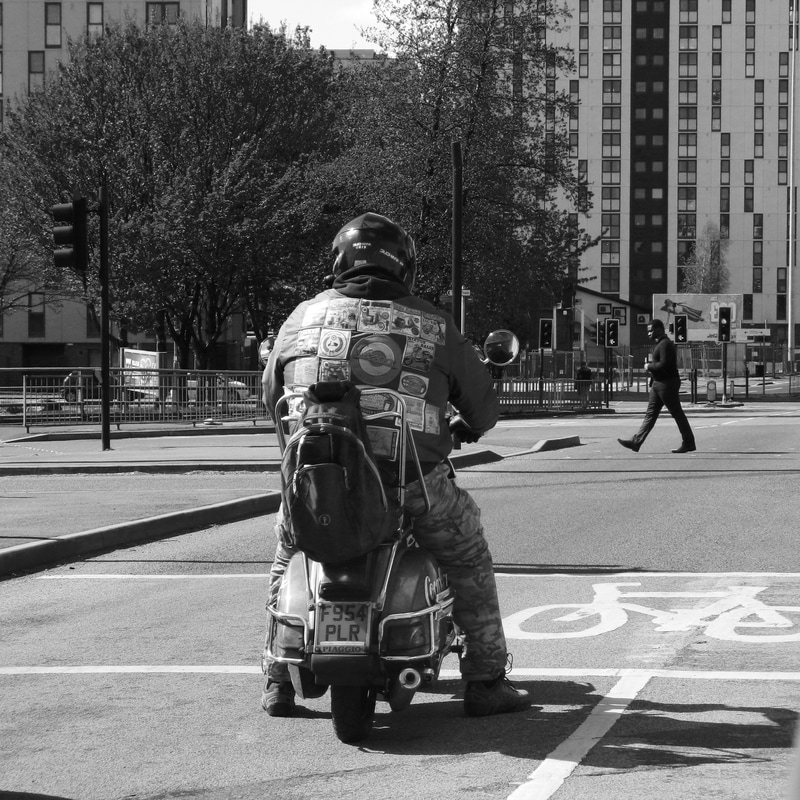
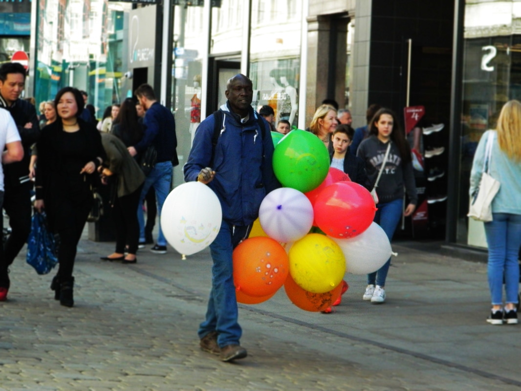
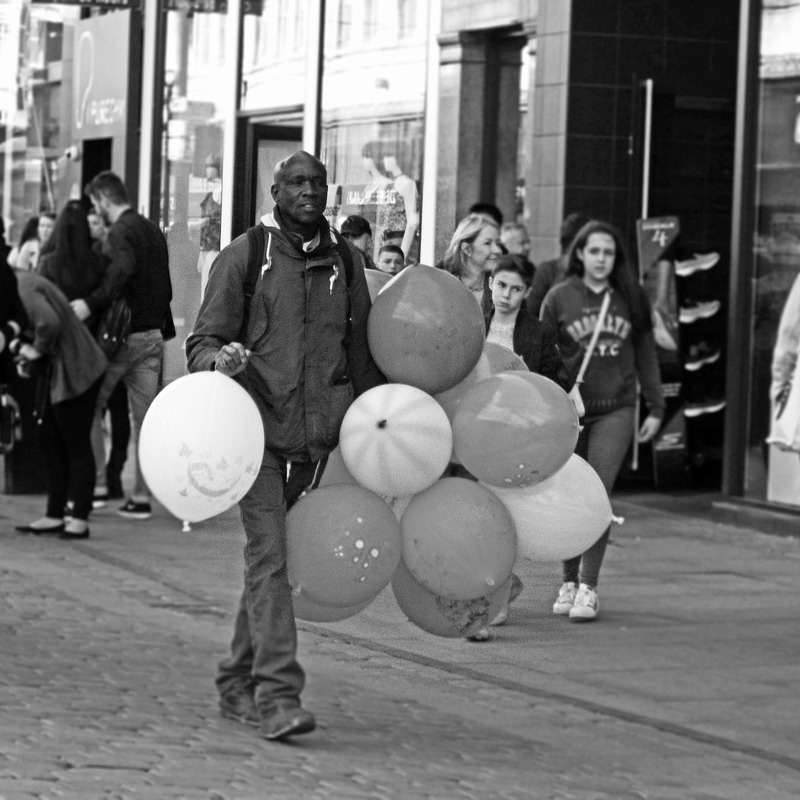
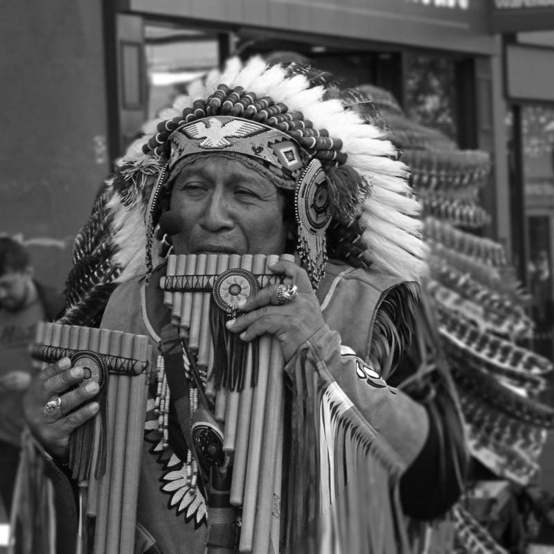
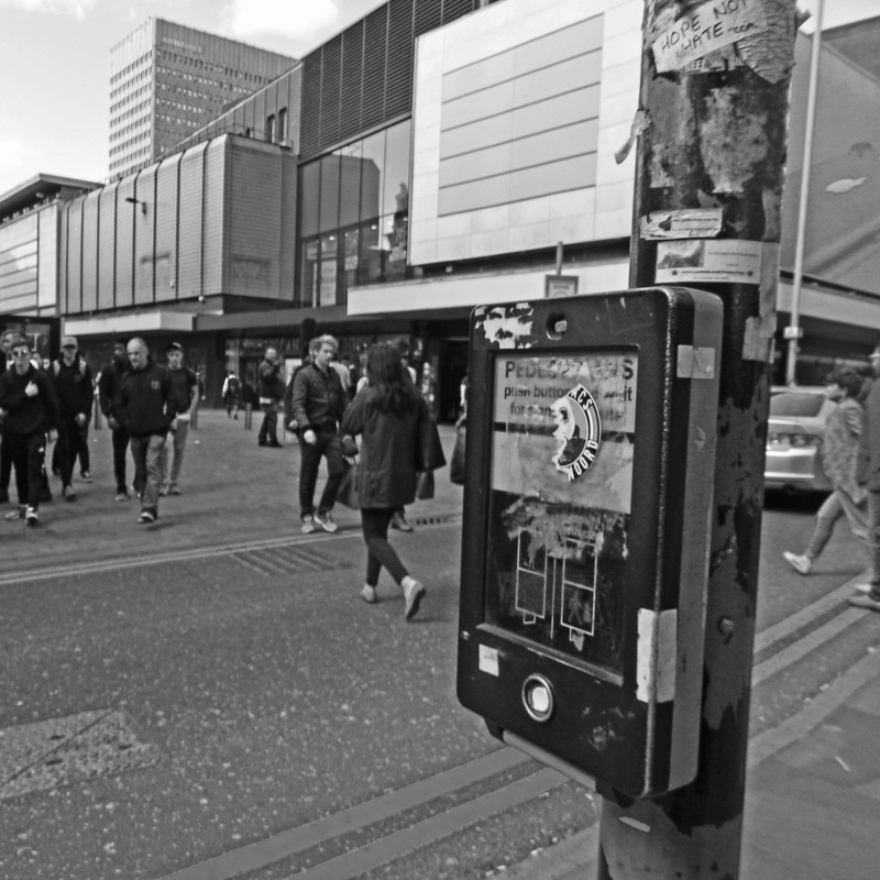
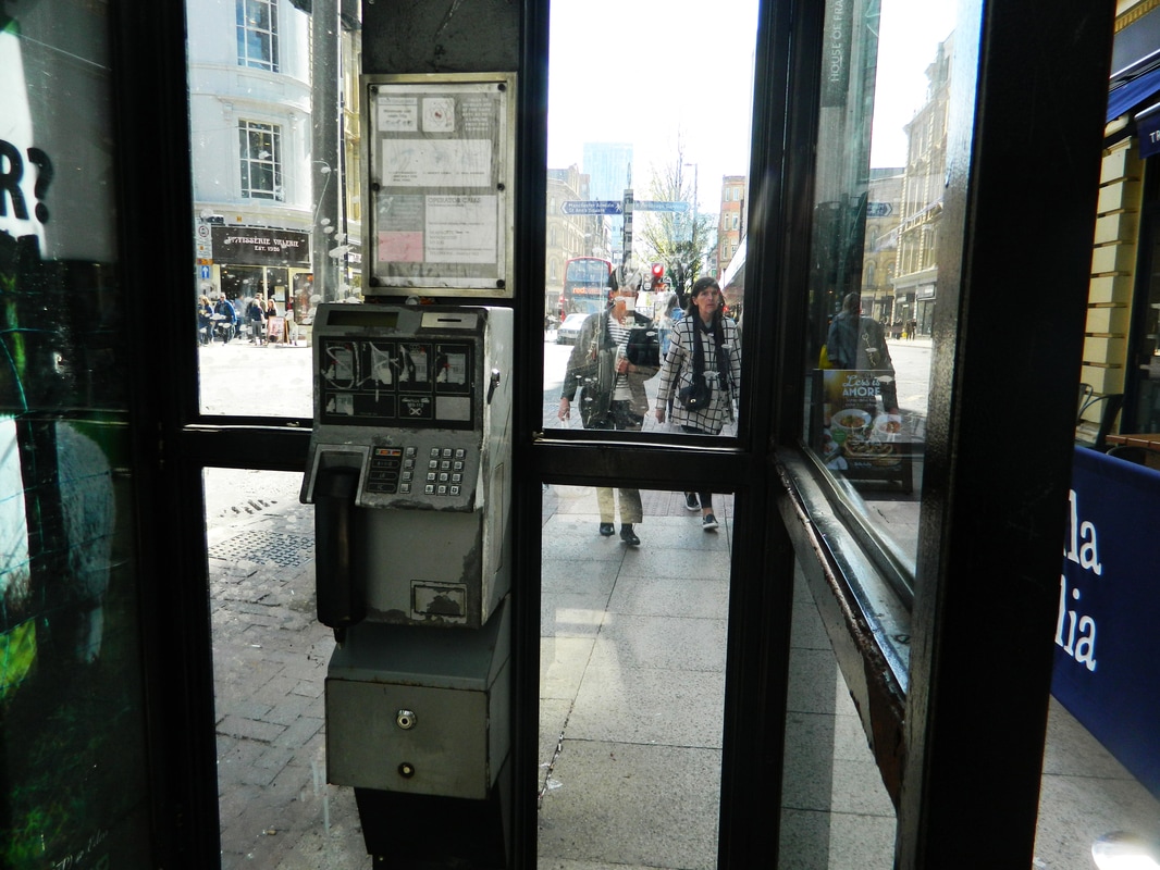
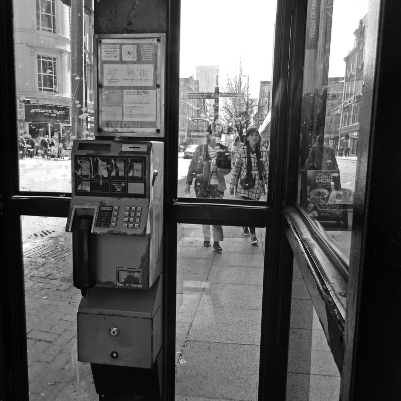
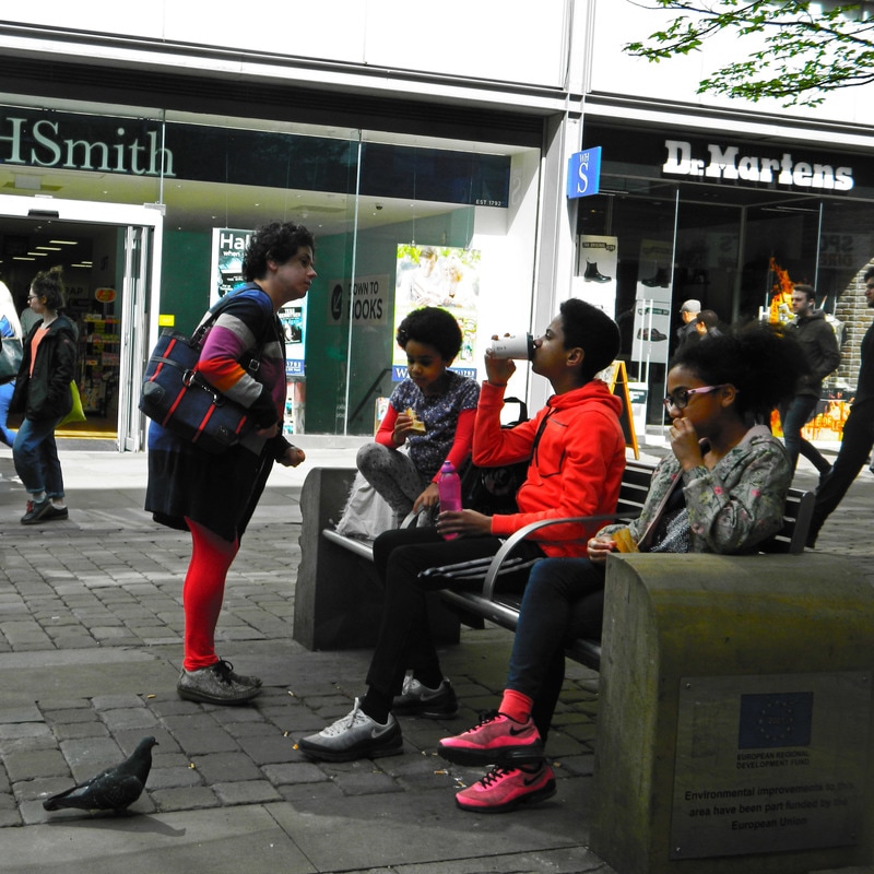
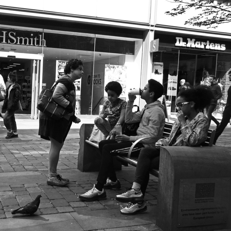
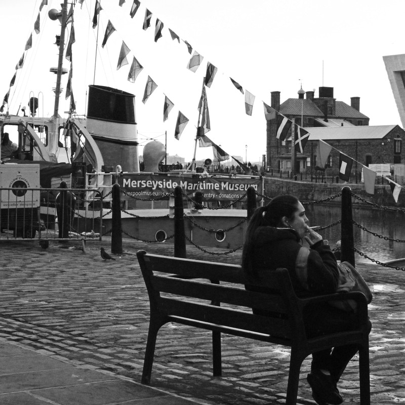
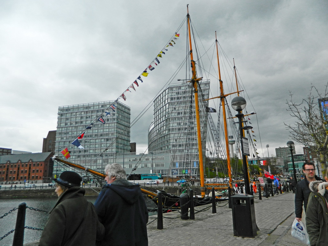
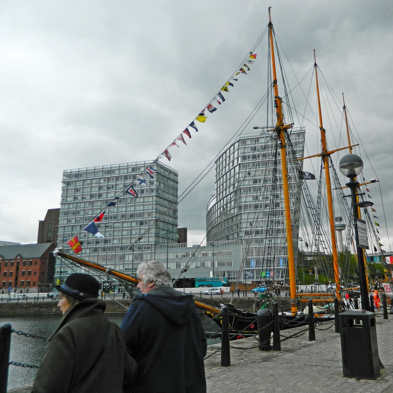
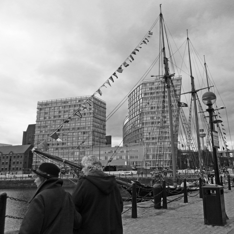
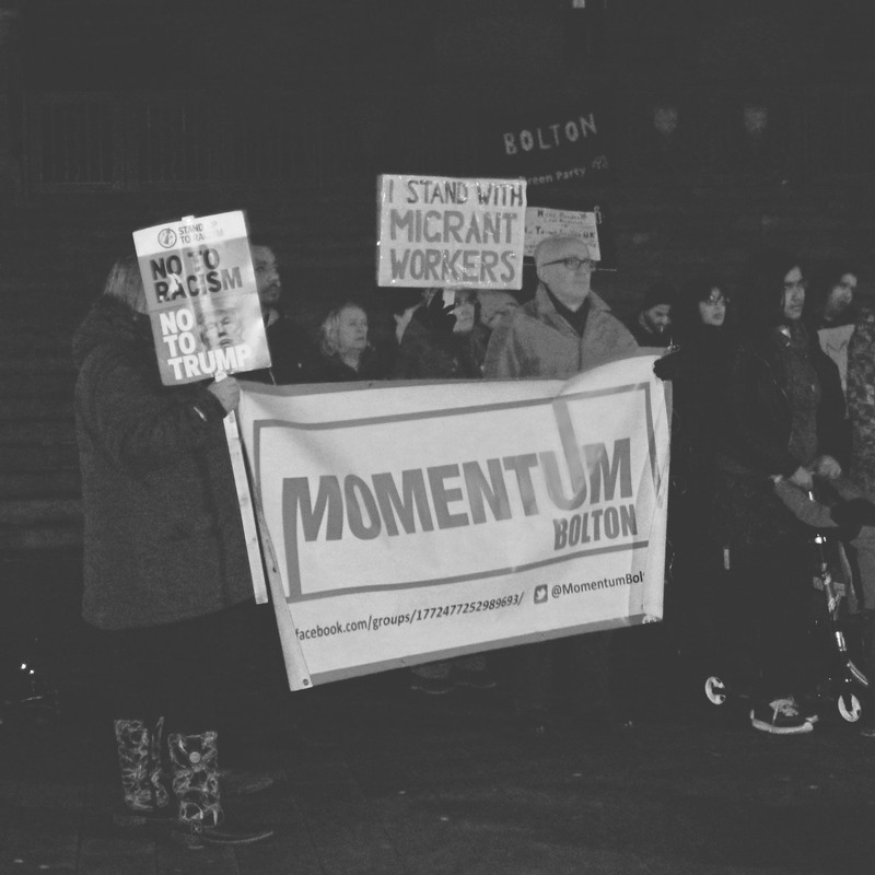
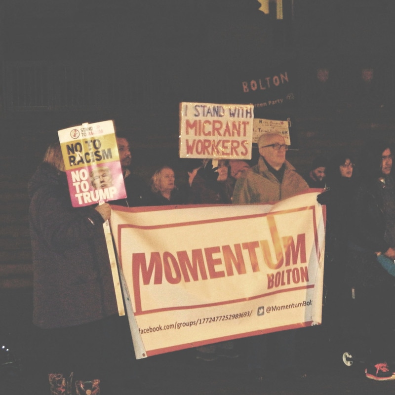
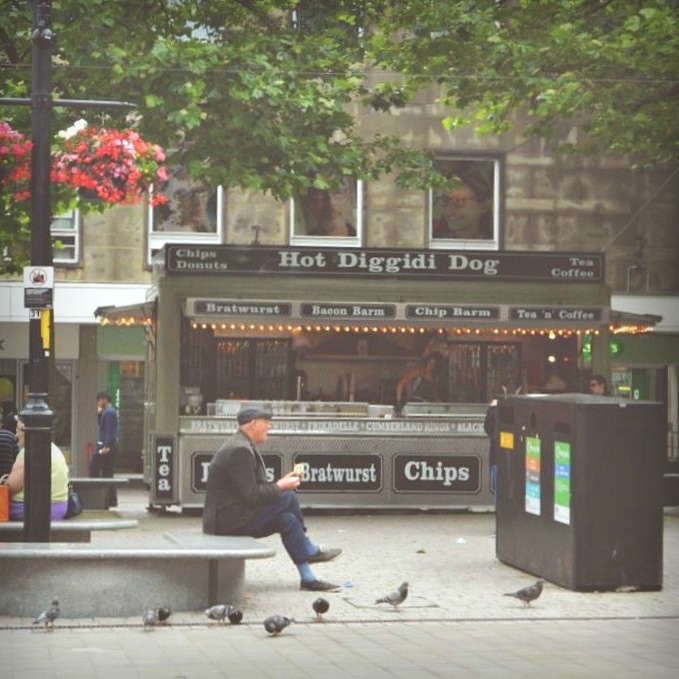
For these photographs I used Photoshop CS6 to manipulate them in the style of my artist references.I first sharpened the photographs to bring out any details and make the image clearer. To achieve the harsh tonal contrasts in Vivian Maier and Gian Butturini's photographs, I increased the vibrance and decreased the brightness slightly. I finally cropped all the images to imitate the square polaroid prints of Vivian Maier and Cas Oorthyuys, and added a black and white filter.
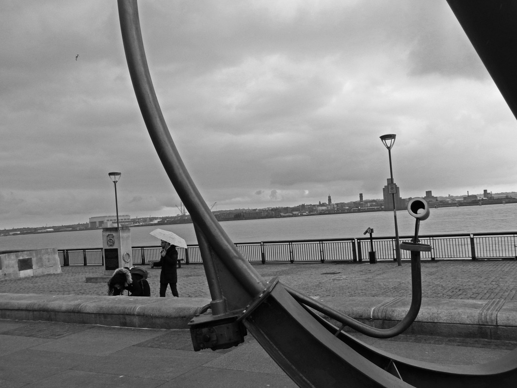
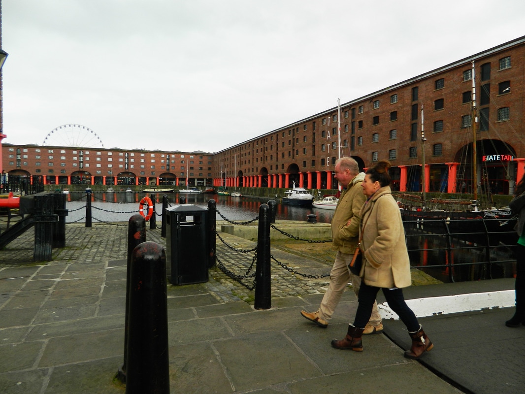
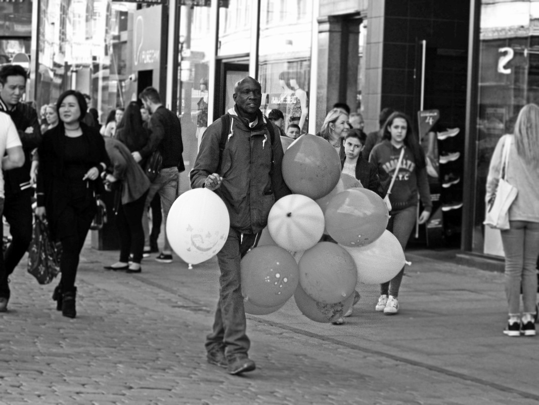
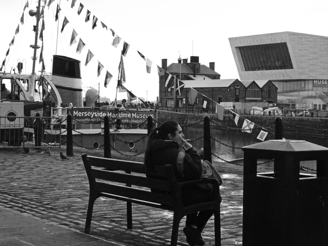
Overall, I prefer my photographs with a black and white filter as this gives the photographs a reminiscent feel and is also a seemingly a popular choice for street photography; it draws attention to the actions and emotions conveyed in the photograph while colour can divert attention away and distract from the main focal point of the photograph.
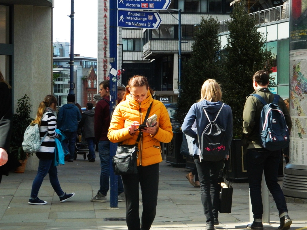
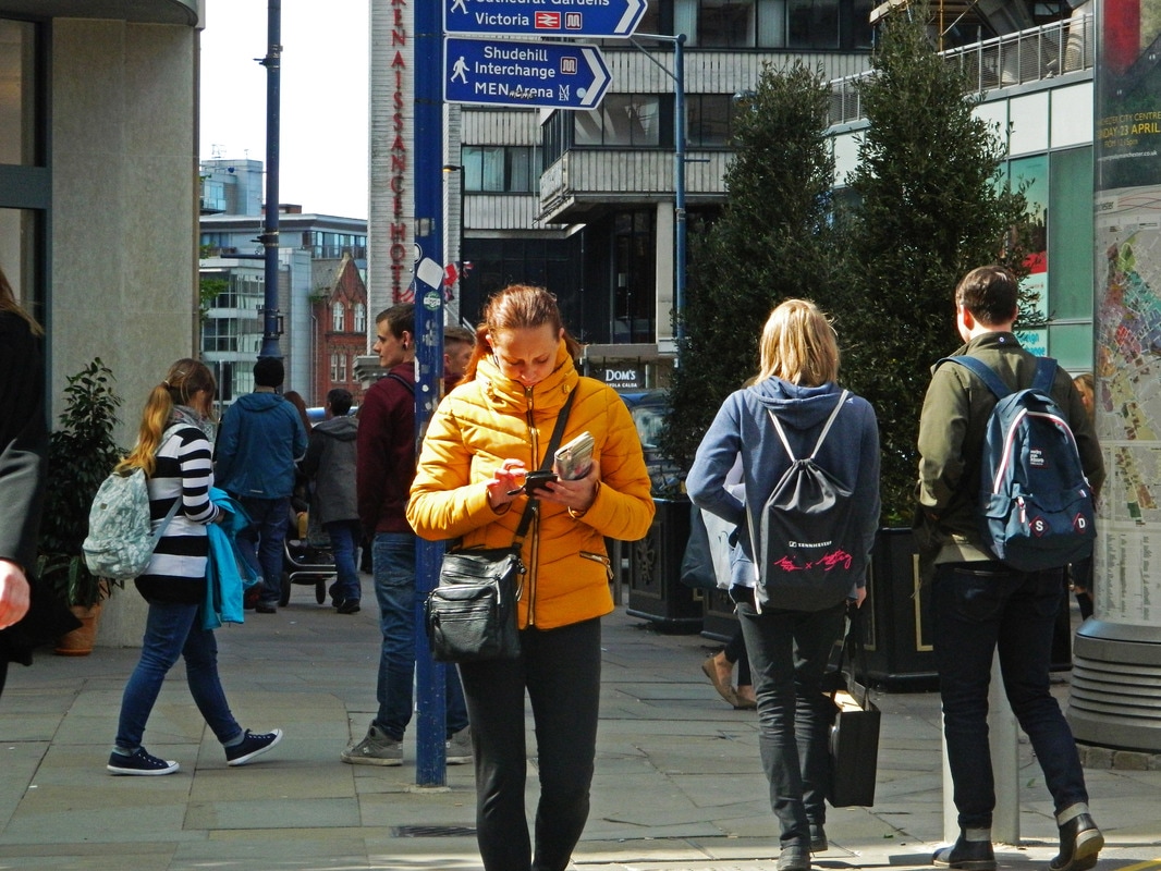
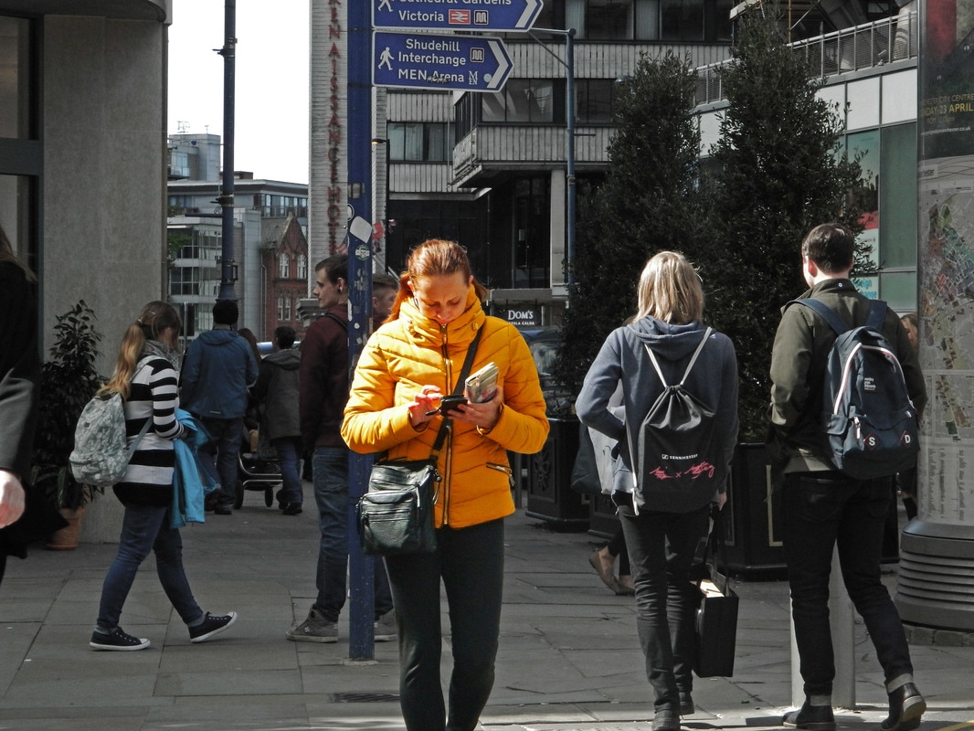
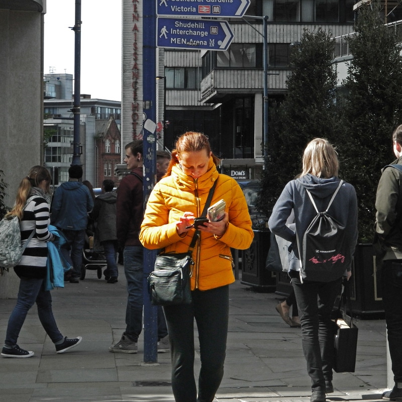
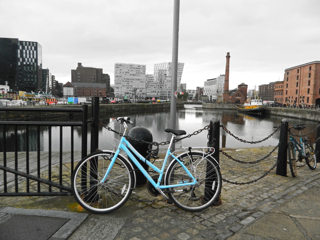
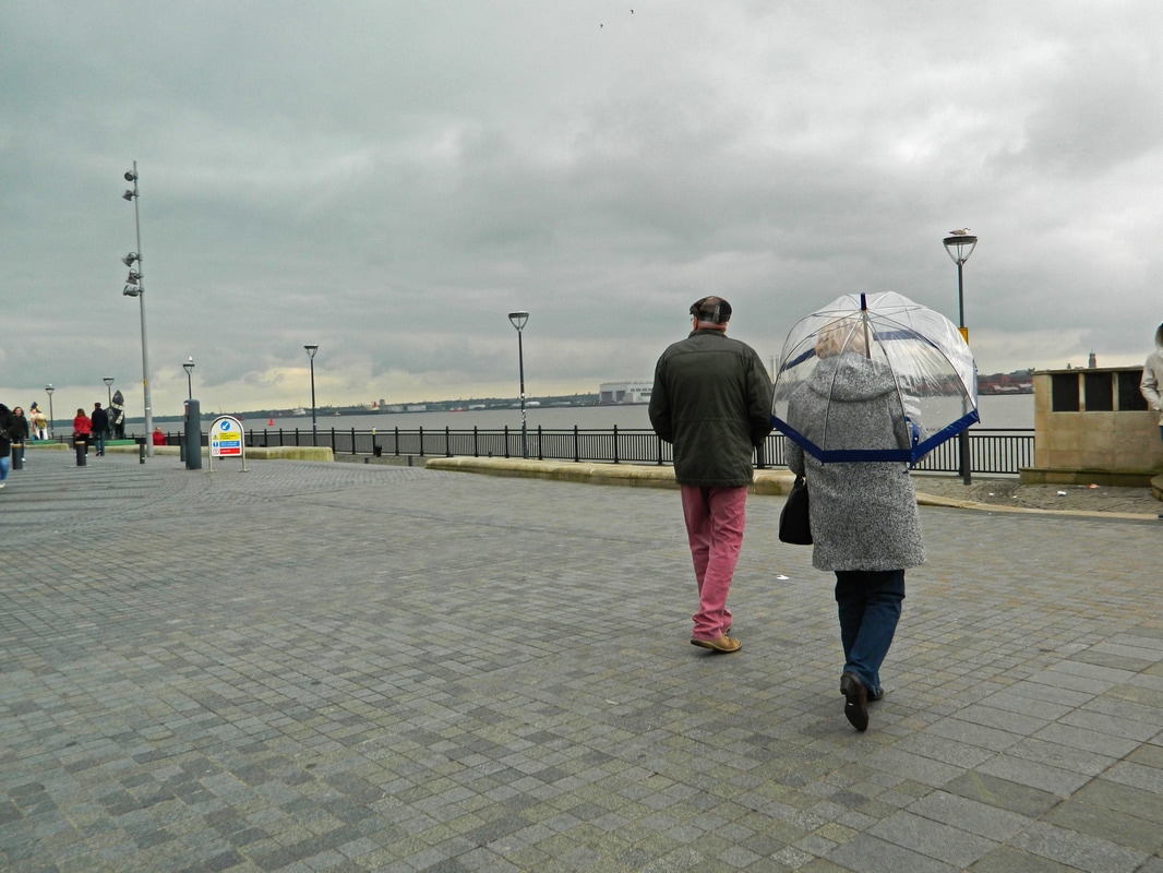
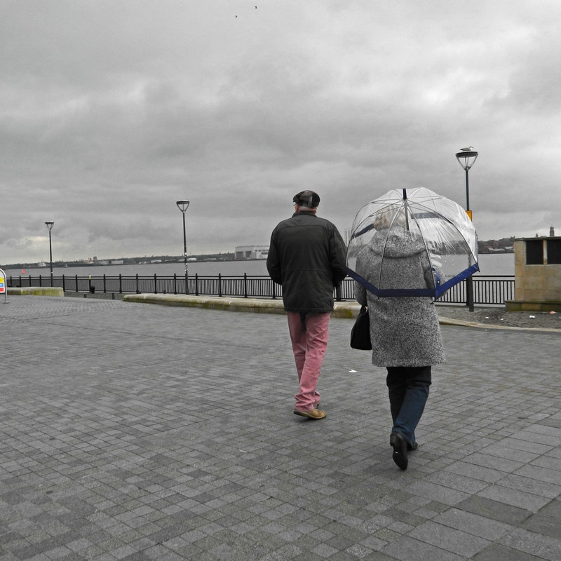
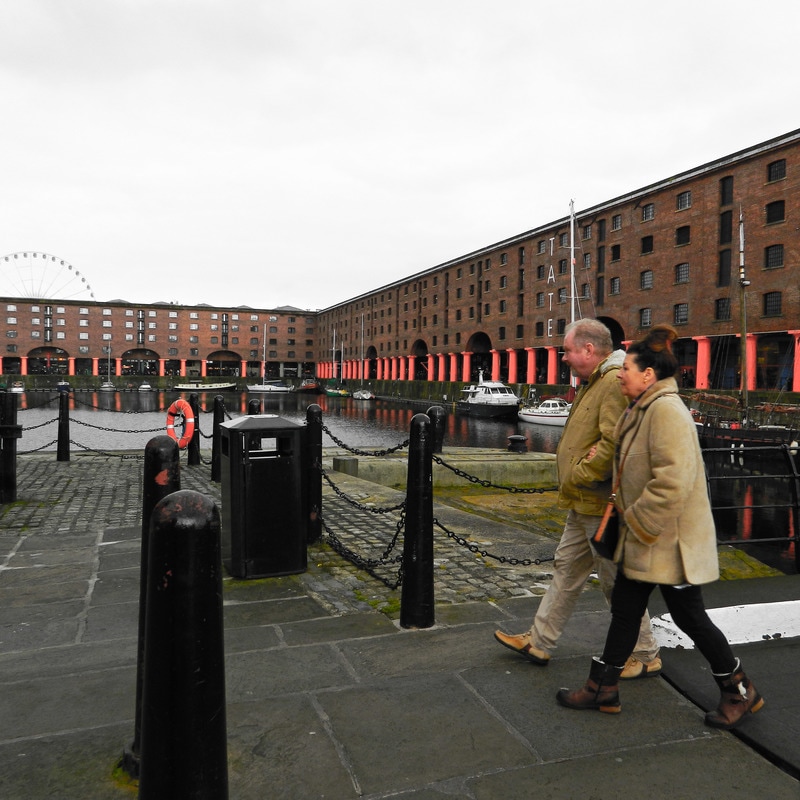
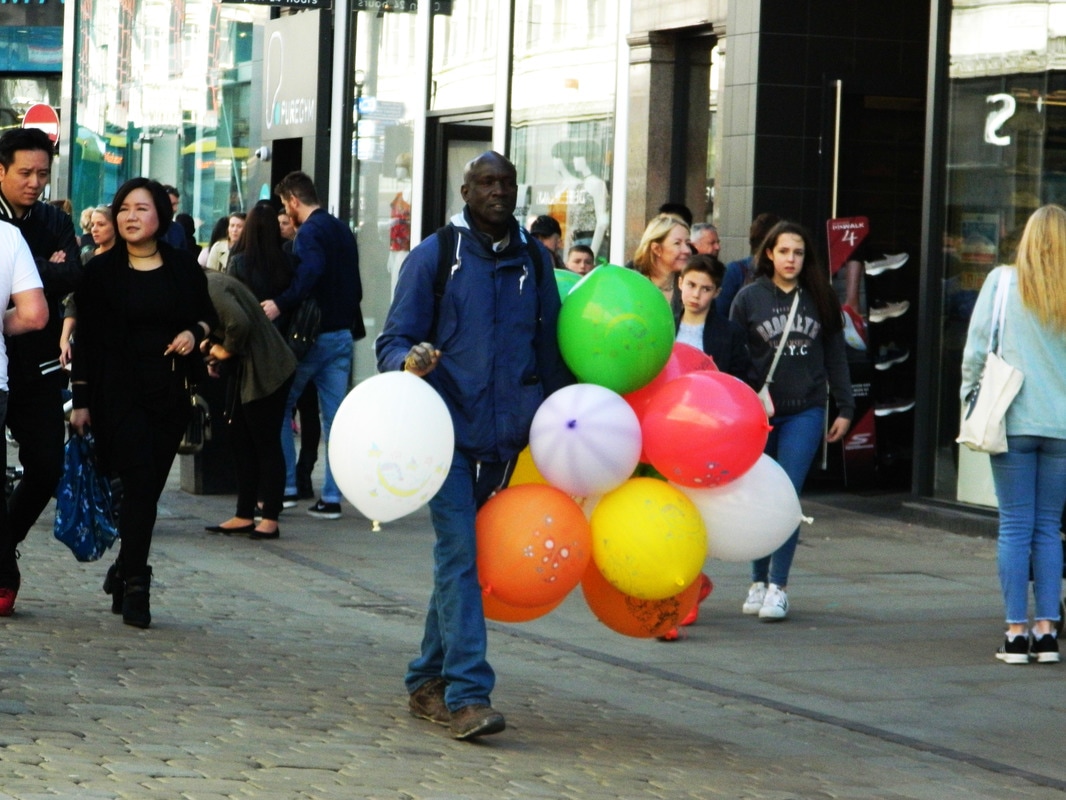
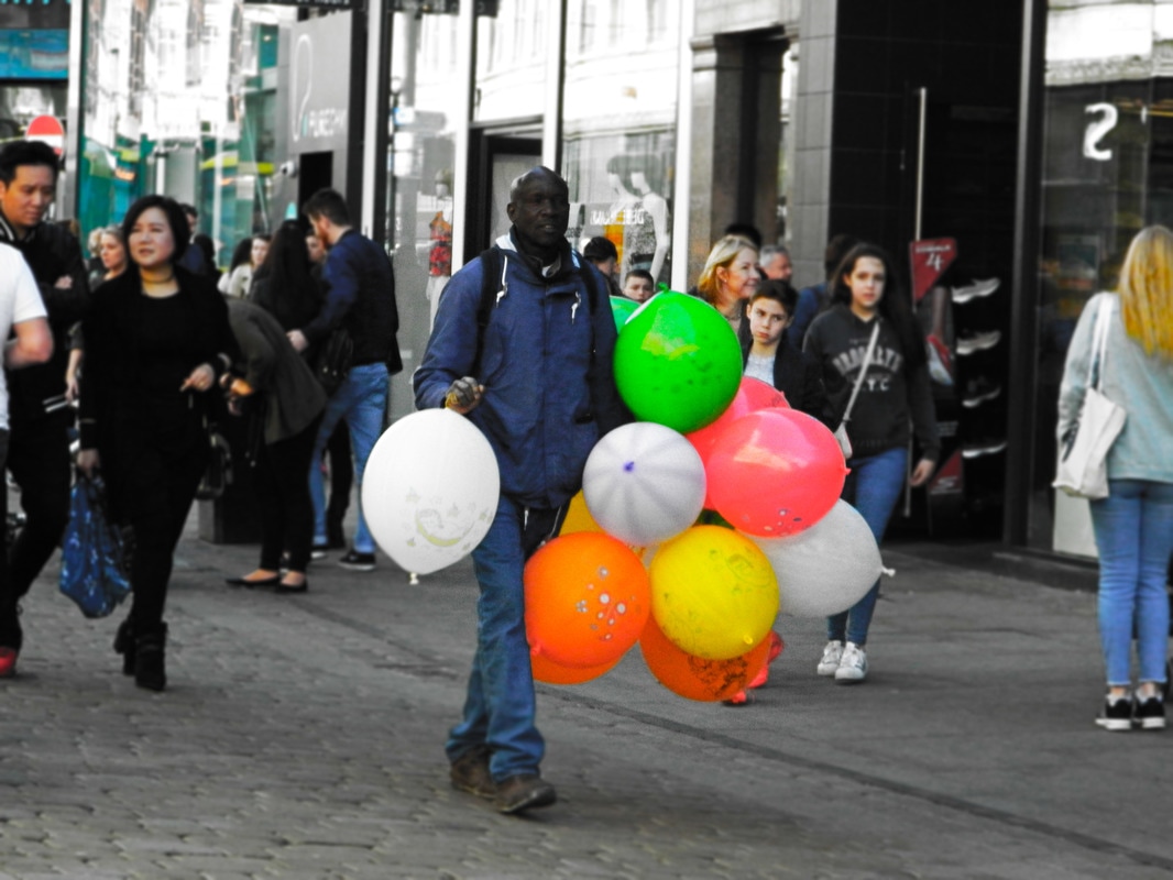
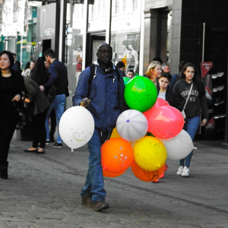
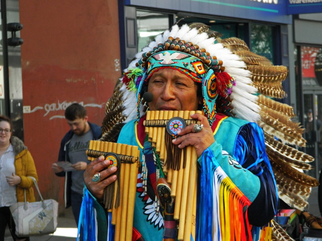
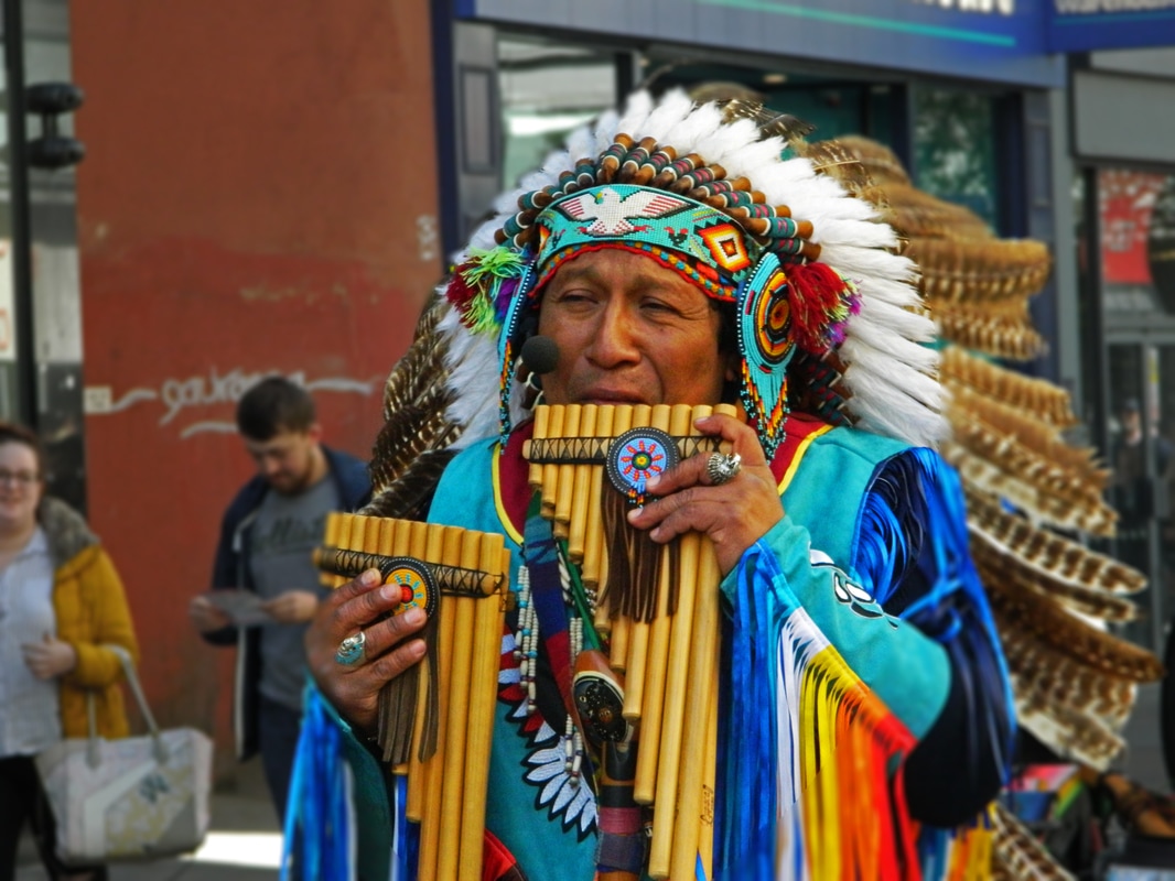
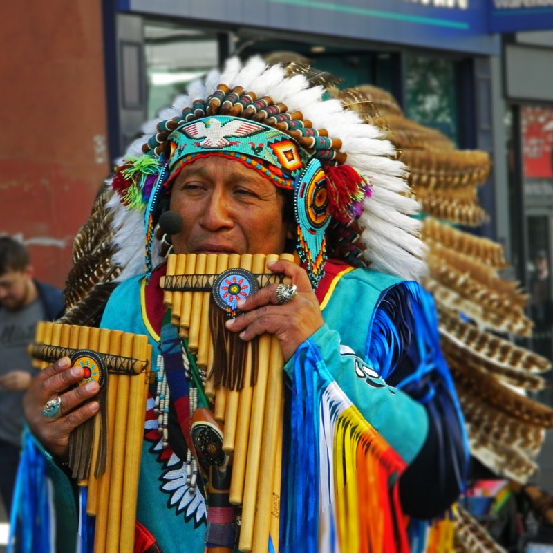
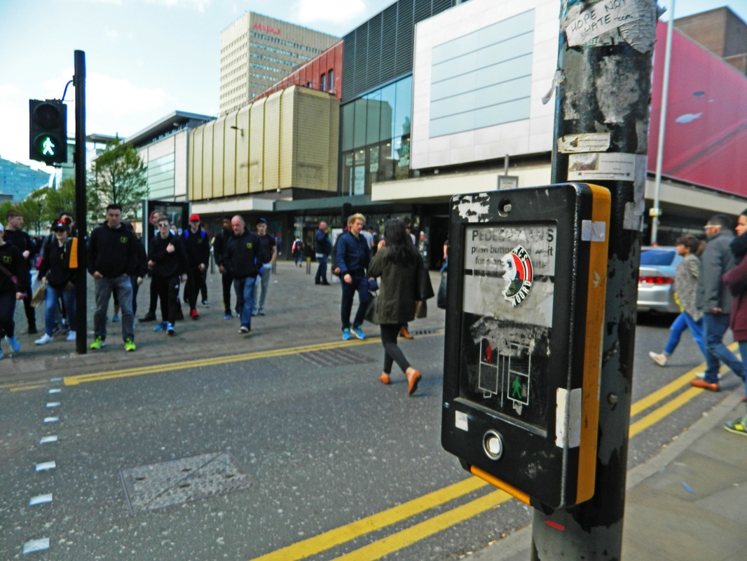
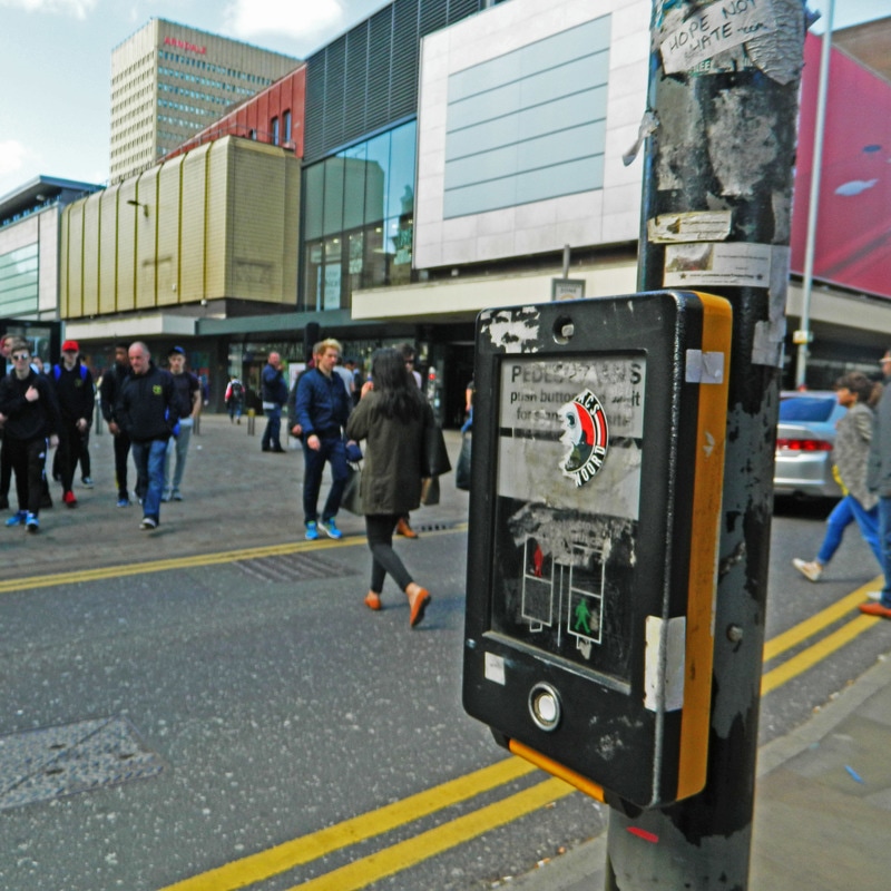
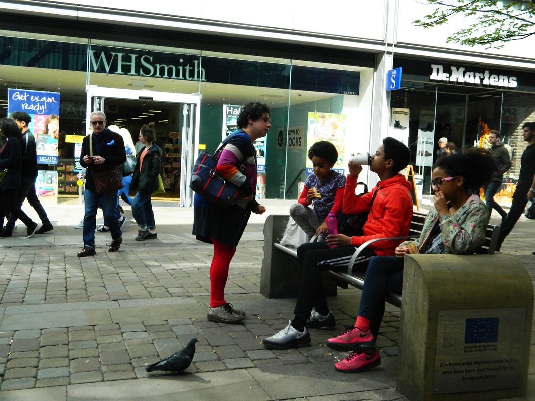
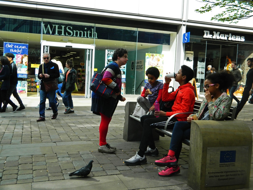
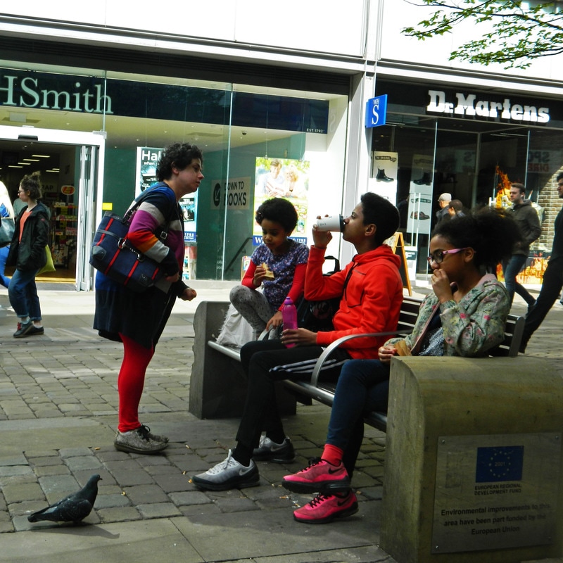
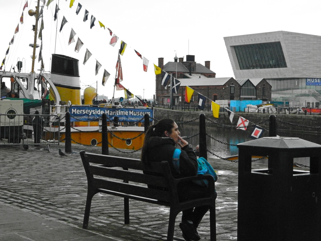
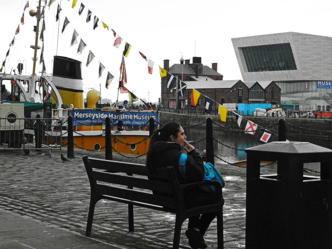
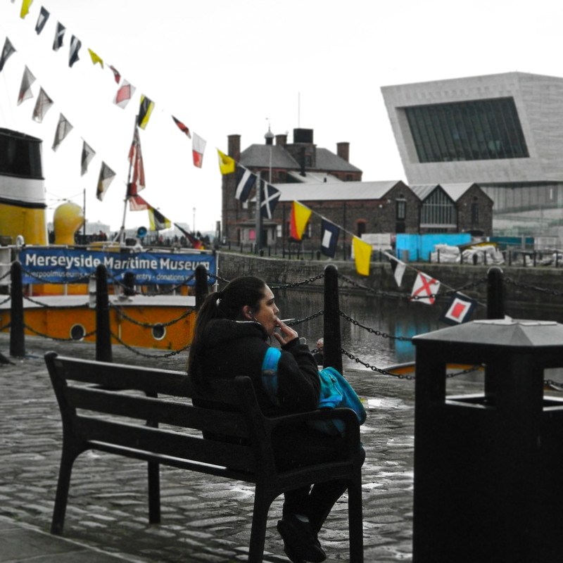
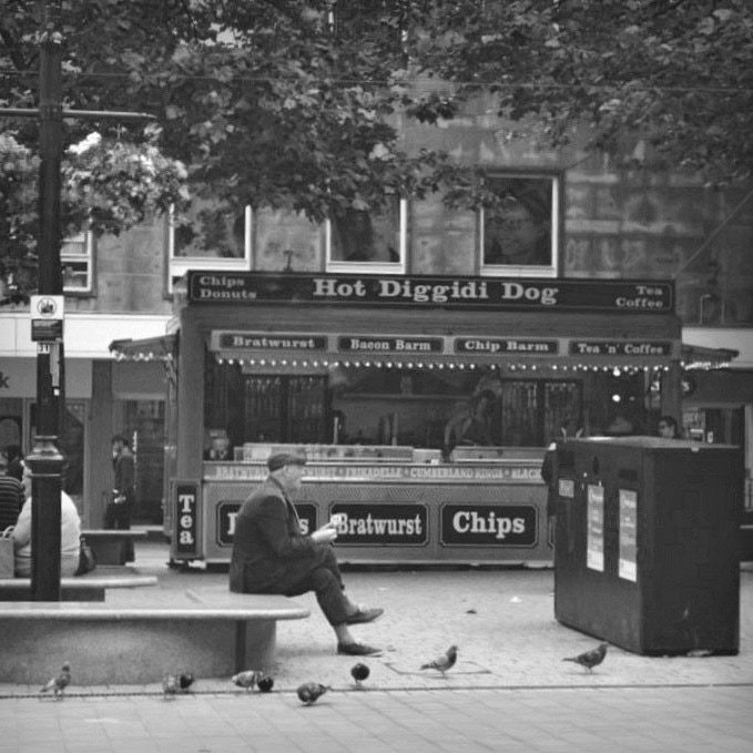
However, for some of my photographs I experimented with colour, and in the style of Linda Wisdom in her 'Colour Box' series, made particular colours stand out by isolating the background and making it black and white or decreasing the vibrancy.
Overall, I prefer my photographs with a black and white filter as this gives the photographs a reminiscent feel and is also a seemingly a popular choice for street photography; it draws attention to the actions and emotions conveyed in the photograph while colour can divert attention away and distract from the main focal point of the photograph.
However, for some of my photographs I experimented with colour, and in the style of Linda Wisdom in her 'Colour Box' series, made particular colours stand out by isolating the background and making it black and white or decreasing the vibrancy.